Well, that wasn’t too hard. A lot of people guessed it right, Frank Babb Randolph.
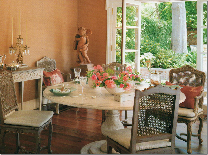
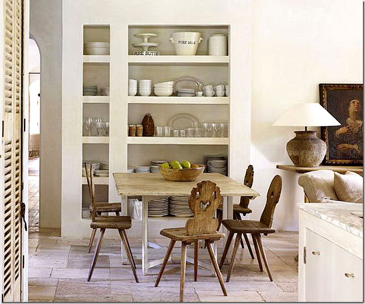
There were a lot of clues, especially with this picture. The dining room with no chandelier, no rug, no curtains – so FBR. His initials sound like FDR with a mouth full of food! FBR even designed that gorgeous table for Niermann Weeks.
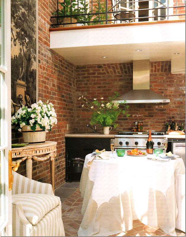
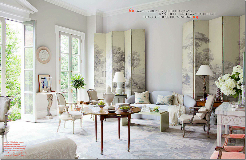
And this picture – really looks like a Georgetown townhouse with the balcony overlooking the gardens.
Plus, there are all the pieces from Niermann Weeks like the console.
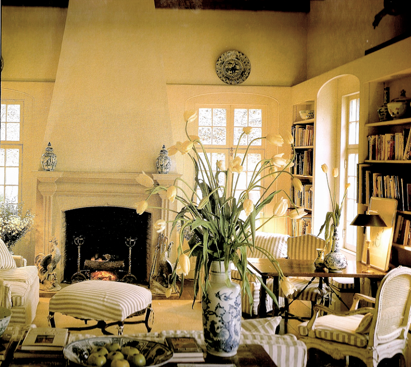
This picture really gave it away – the awning striped chair. Remember this same chair was in his own house?
Remember FBR had these striped awning chairs in his townhouse before it was redecorated? And that medallion between the doors was another giveaway!!
Loi Thai from Tone on Tone told me he now owns those two striped chairs! This is a picture from Loi’s former house. Love this so much – almost as much as his new house! I just really am crazy for Loi’s style. Loi and FBR both are from the same area and their styles are very simpatico.
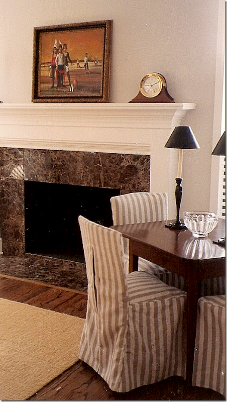
I love that awning stripe linen too. I’ve told this story before, but around 22 years ago, I saw this picture of a living room that Dan Carithers had designed and I fell madly in love with it. Actually I still love it as much today. At that time, Ben and I had just married and moved to Ft. Worth. We had a new little house that needed decorating, so I decided to try and copy this room. Everything was covered in this same linen stripe.
I wish I had more pictures of that room – but here, you can see, I had a game table with four slipcovered chairs. Hardwood floors and a coir rug, this was before you readily find seagrass. I even have the same brown marble that I have in my house now! And looking at this, I am laughing at the slipcovers – some things never change, even all these years later!
I remember I took this picture the day the furniture arrived – the awning striped linen cushions for the wicker chair weren’t ready for the delivery (I remember being so devastated over that!!) A skirted table in a linen ikat pattern holds a few antique books and the beginnings of my blue opaline collection. My two antique French chairs sat in front of the coffee table – also in the awning stripe. Looking at this room – done so many, many years ago - my style hasn’t really changed as much as I thought it had!! Back then as now, it was all about texture, linen, stripes, urns, wicker, and antique accessories and furniture. The main difference is I had paintings instead of mirrors. But, what this shows and what this story about Frank Babb Randolph shows, is while fabrics and colors may change, the basic way we decorate really doesn’t. If this room was contemporary – I would have to say it was very different! And if the house that Frank Babb Randolph had designed was done with large sectionals and vibrant colors, I would say his style was very different. But as you can see, FBR really hasn’t changed his basic aesthetic over these many years and neither have I.
And the sofa, not slipcovered. This was the last sofa I bought that wasn’t slipcovered. And that’s Ben, looking very young and cute – with Reggie, our first dog and the first of our beagles. The painting above Ben was my mother’s, borrowed from her. The artist is a very famous Houstonian – Herb Mears - who just happens to be the father of the famous Houston architect, Kirby Mears.
You remember this gorgeous house in Veranda, designed by Eleanor Cummings. The architect was Kirby Mears. Small world, isn’t it? And Kay O’Toole’s enfilade house? He designed that house too, amongst many ,many others.
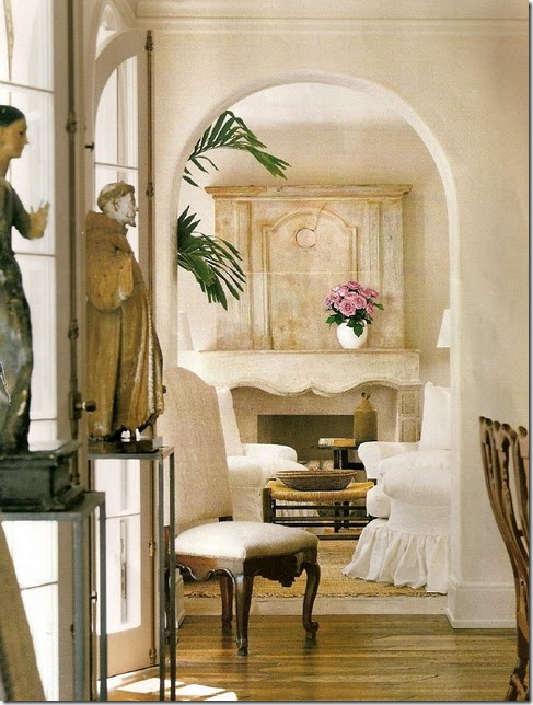
And going back to the Georgetown Townhouse, above, in the winter side of the living room was this medallion which should have give everyone a vital clue! FBR loves to use these in his designs. Then, and now.
And here again, in FBR’s newly redecorated living room, the same kind of medallion. He likes to use these instead of paintings – much the same way others use mirrors. Plus, the round shape is wonderful to break up linear areas, like in between two windows. Love this room so much. Love, love, love!!!!
As far as your wrong guesses – the second most mentioned possible designer of the house was Houstonian Pamela Pierce. Pierce too has had a certain identifiable look over the years, though her recently shown redecorated house in this month’s Veranda is far more contemporary than Pierce has been before. But is this really true? Over the years, Pierce’s designs have been increasingly pared down and she’s been mixing the new with the old for some time now. While her interiors have always been about antiques, her designs lately are more streamlined.
Remember this gorgeous house that Pierce designed with furnishings that mixed contemporary with antiques? This house showcased a subtle change in style in Pierce’s designs. This month, Veranda shows her own house, that is remarkable for its many contemporary pieces. Many have asked me for my opinion of her new house – so let’s take a look:
Pamela Pierce: Then Versus Now:
Décor #1: The first look at Pam Pierce’s Houston house. Located in the classic, leafy Museum District, her house is gorgeous outside and in. The white stucco façade is timeless with its arched windows, and the landscaping is beyond beautiful – a sea of green mixed with gravel. Here is how we all saw her living room many years ago. Linen covers everything, including antique furniture frames. The woods are mostly dark and heavy Spanish and French pieces.
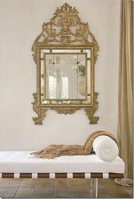
Décor #2: This photograph of her revised living room showed up on the internet – I happen to love it. I liked the introduction of white mixed with the linen. I loved the touch of contemporary with the classic day bed. And, I also loved the coffee table with the velum books. It was still all Pierce, just with a new take – a few contemporary pieces, yet classic ones.
Décor #2: The daybed juxtaposed with an antique gilt framed mirror. Gorgeous ying and yang – gorgeous Pam Pierce.
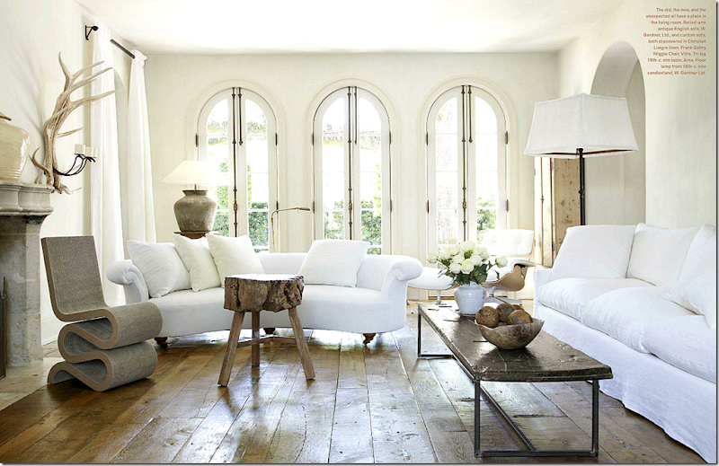
Décor #3: And today – what a difference. Or, is it, really? All three rooms have no pattern, the fabrics are all the same – white vs. linen – so the effect of the rooms are the same – calm, soothing, not jarring. All three rooms rely heavily on texture instead of pattern. The new design use classic pieces of furniture – the original antique sofas mixed now with a contemporary one. And these contemporary pieces are classic – the Gehry chair, the Eames chair. Pierce says she wants her house to be edgier, and choices like the Wiggle chair are definitely more edgy than an antique ottoman. Each three versions of the same room is light on accessories, and what accessories there are - are overscaled and important. Pierce says she got tired of gathered skirts – yet her pieces are still slipcovered, just tailored. And she says, she wanted a mix of the antique and the contemporary. A total contemporary interior leaves her cold. The new room is even more highly edited than the other two designs – but all are very highly edited, make no mistake of that. So has the room really changed that much? I suppose it has if you love Cathedral candlesticks. But, the feel of the room, the atmosphere, is basically the same, as are the adjectives: spare, quiet, edited, classic and sophisticated.
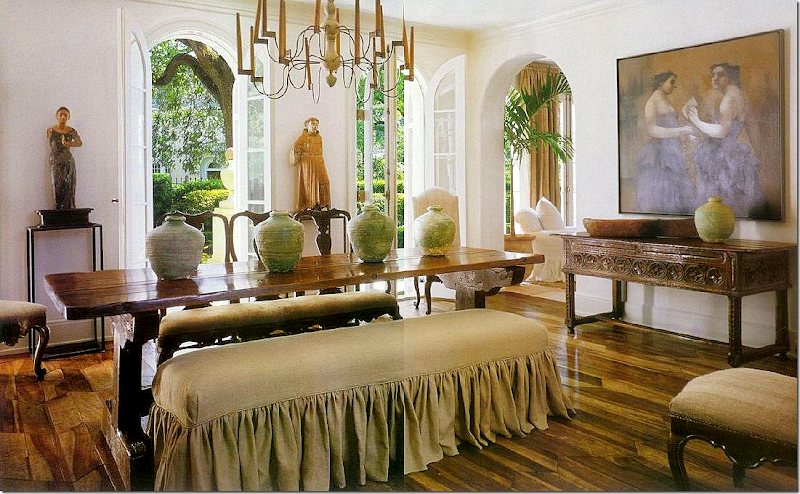
Décor #1: The dining room might be the most changed. Originally there was a ruffled slipped bench and dark Spanish and French furniture, with oversized Santos.
Décor #2: In the second design, lighter woods appear with gorgeous antique wing chairs. The feel becomes more Belgian than Mediterranean. Is is different? Yes, the details are different, but the again, the adjectives remain the same: spare, quiet, edited, sophisticated.
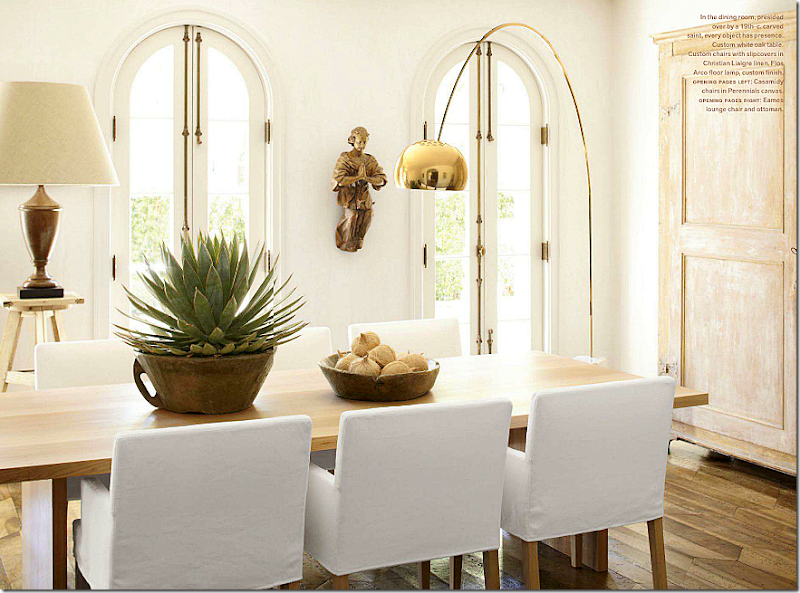
Décor #3: Today the room is both rustic and modern at the same time. Slipcovered chairs and light woods are contemporary, as are the lamps, but the accessories are antique – with a beautiful carved Santos, as is the armoire. This aesthetic change seems like a natural progression to me, what is to be expected from someone who has always liked heavily edited interiors, with little color, and much texture. As much as I loved the first dining room, I can see it would hard to go back there, instead of going forward.
Décor #1: The breakfast area off the family room is another oft-changed room. At first, it was all wood benches.
Décor #2: And next, it had a more Swedish/Belgian feel with an antique table and chairs.
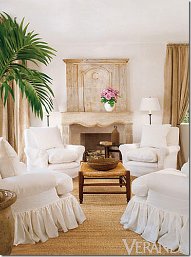
Décor #1: The breakfast room connects to the family room with its beautiful antique French mantel. At first, the room had four slip covered chairs with ruffled skirts.
Décor #1: With the four slipped chairs and ruffled skirts. The coffee table is a textured rush ottoman. Linen drapes add more texture, along with the seagrass rug.
Décor #2: Next we got a glimpse of the same room, with the slipped chairs now in the linen – and the breakfast table is a classic contemporary Saarinen tulip table, mixed with antique chairs as seen before. Pierce added curtains made of the same linen.
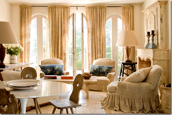
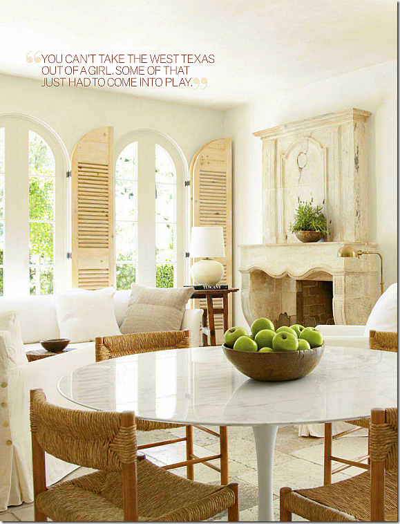
Décor #3: And today, a white linen slipcovered sofa and two chairs mix with the tulip table and rush seat chairs. Shutters take the place of the curtains, a good choice, IMO. To me, this room is closer in design to the first image, than the second. The focal point is the fireplace and then the windows – the furniture is secondary. I’m a sucker for the marble topped tulip tables, so I love this choice.
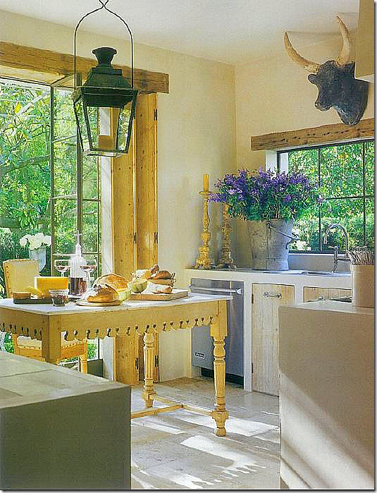
Décor #1: The kitchen again is much the same – the only change is the island. Here, the original view, with an antique butchers table – this is a favorite of mine and has been all these years. I love the styling, the tin flower vase, the oversized French lantern, the candlesticks, the cow’s head.
Décor #2: Kitchen
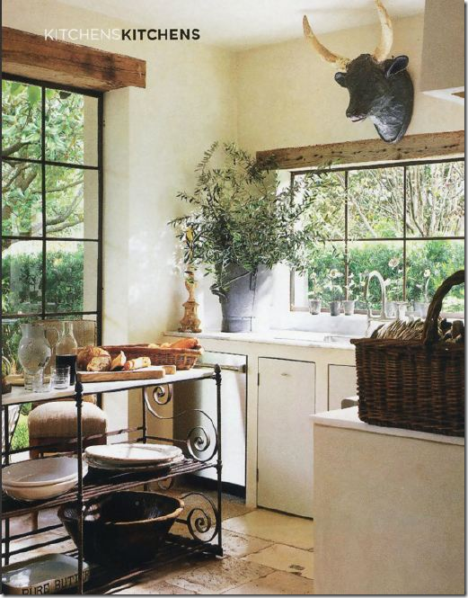
Décor #2: The second version of the kitchen sees the island switched out for a French bakers table. Still styled much the same as before, the bakers table is probably a better choice for the kitchen than the butchers table.
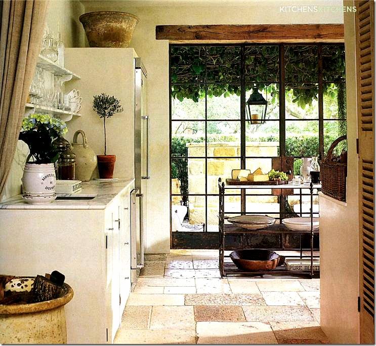
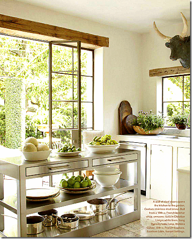
Décor #3: And today, there is a more industrial, custom designed island in stainless steel.
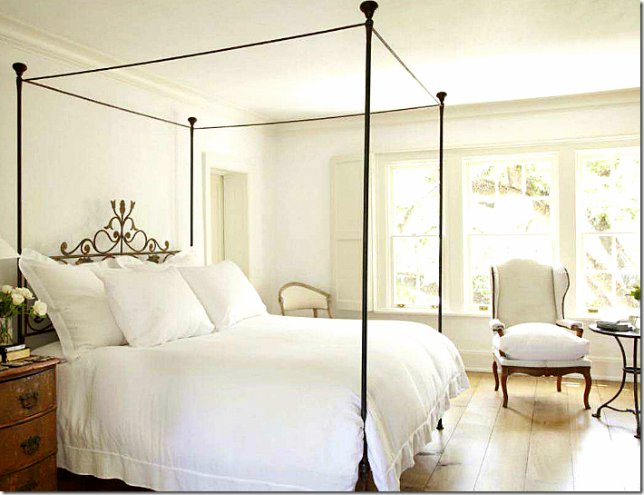
Today: the master bedroom. I don’t think we’ve ever had pictures of this room before. A simple iron bed that just happens to be 19th century Italian, with white linens and a beautiful antique wing chair, shutters at the window. Very classic, edited, quiet, elegant and soothing.
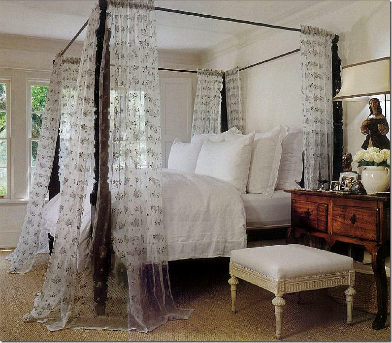
Décor #1: The guest room. Dark wood furniture with a light, painted French stool. Sheers at the bed with seagrass. Love the lamp and the end table with the French stool.
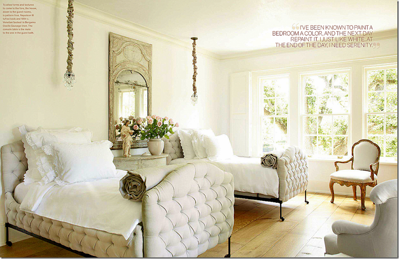
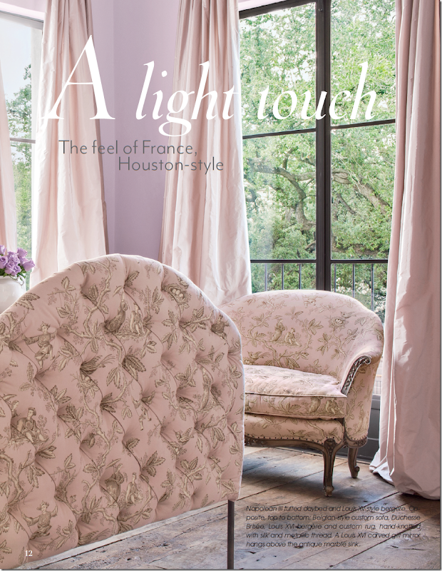
Décor #2: And today, the guest room, her granddaughter’s when she visits, is just dreamy. I love those tufted antique Napoleon III beds, in linen, mixed with white bedding. Love the rolled comforters and the Swedish demi lune and antique mirror, with a santos, bare floors, and shutters. While the beds are the focal point, the hanging lights add just a touch of romance and femininity. So pretty. These Napoleon III beds remind me of the beds used in her client’s house. I’m dying for a pair of these!!!
Remember this gorgeous, just GORGEOUS guest room for a client? The same bed, with an Oriental toile in pink and mauve silk curtains, plain wood floor (laughing at the word plain for such hardwoods!,) and French settee. The same feel as Pierce’s guest room, but this client wanted color and pattern, something that Pierce doesn’t in her own house. To die for!!!!
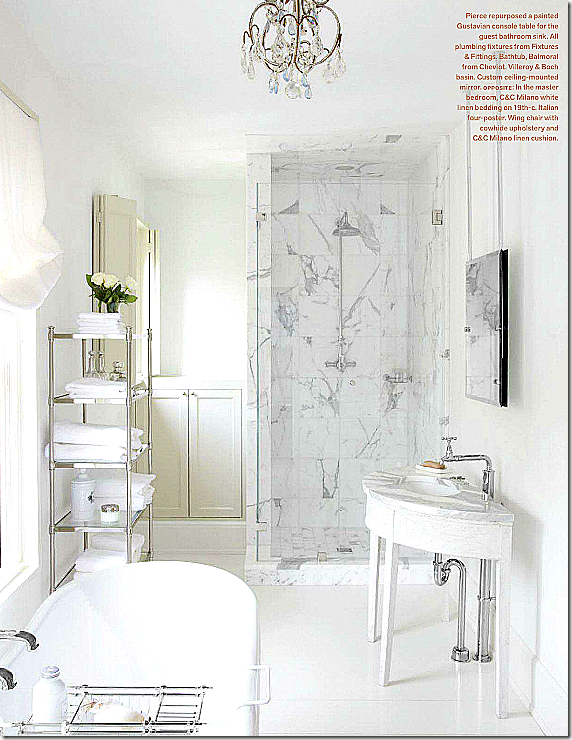
And another view never seen before – the guest bathroom. The mate to the room’s demi lune table is here, made into a vanity for the sink. White marble is a classic choice. A contemporary touch is brought into the room with the etagere.
Two designers seen through the years, Frank Babb Randolph and Pamela Pierce. Have their styles changed? Somewhat. Could you recognize their work from years ago? Many of you did with FBR! Can you change a few details, like colors and patterns, and furniture styles and keep your basic aesthetic? Yes. You can, as seen by these two designers. Moving forward with a newer look, you can still retain what you’ve loved through the years. Want to add an edge to your look? Do what Pierce did and add a classic contemporary piece like an Eames chair or daybed. Edit your accessories for a newer look – but keep the pieces that define your look – just maybe less of the pieces. If you notice Pierce still has santos, just not as many as before. Over the years, FBR’s rooms have become leggier looking – which defines his rooms. Yet, over a decade later, his look is still there and identifiable!
Now my look……ha!!!
I want to give huge thank you to a poster who came up with a new Hall of Famer name for Sammie Jo Sosa Webb so we don’t have to rename her: Sam Rice.
Monday, 25 March 2013
The Answer: Then and Now
Posted on 21:34 by Unknown
Subscribe to:
Post Comments (Atom)













0 comments:
Post a Comment