Today’s reader first sent me pictures of her newly remodeled kitchen last year. Right before I was going to show them on the blog, she got word that her kitchen was being considered for publication in a national magazine. The scout, the famous Bonnie Broten, asked that I please hold off showing the reader’s kitchen until the pictures were published. All that takes a lot of time. First the project has to be approved, then there is a photoshoot, and usually there is a long wait until publication. The magazine, BHG’s Real-Life Kitchens and Baths, only comes out a few times a year, and this issue, Summer, was just released a few weeks ago. All the kitchens and baths in this magazine are “real life” – meaning the budgets are more realistic than those found in some of the other magazines.
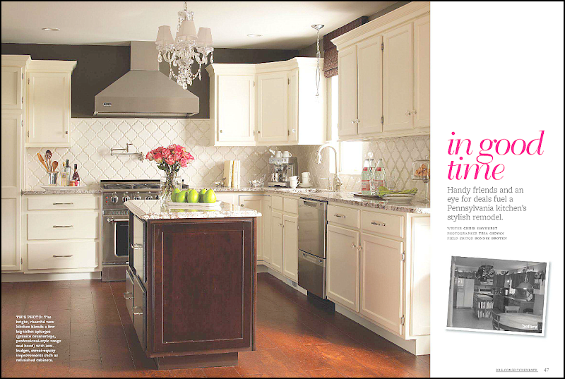
Here’s a screencap of the article called “in good time” about the reader who hails from Pennsylvania. The article shows the before pictures and gives a break down on the budget.
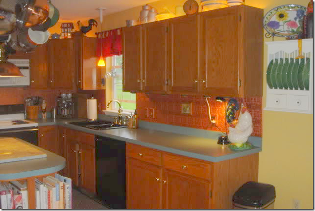
Here’s a look at the “before” kitchen, with its dark cabinets and green countertops.
Notice the up lights above the cabinets!
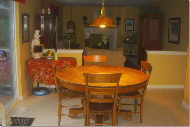
The attached breakfast area leads into the family room – through half walls.
The reader and her husband had been happy with their kitchen, until they attended a home show in their Lincoln University neighborhood. Once they got back home, they were afflicted with that same disease that strikes many people after touring show houses – “ihatemyhouseitis.” Their once loved kitchen now seemed dated and dark and they decided it needed an update, STAT. To keep costs down, they did all the work themselves – except for the installation of the granite and running the new gas line. Friends chipped in with their labor and expertise. In all, the renovation took a year.
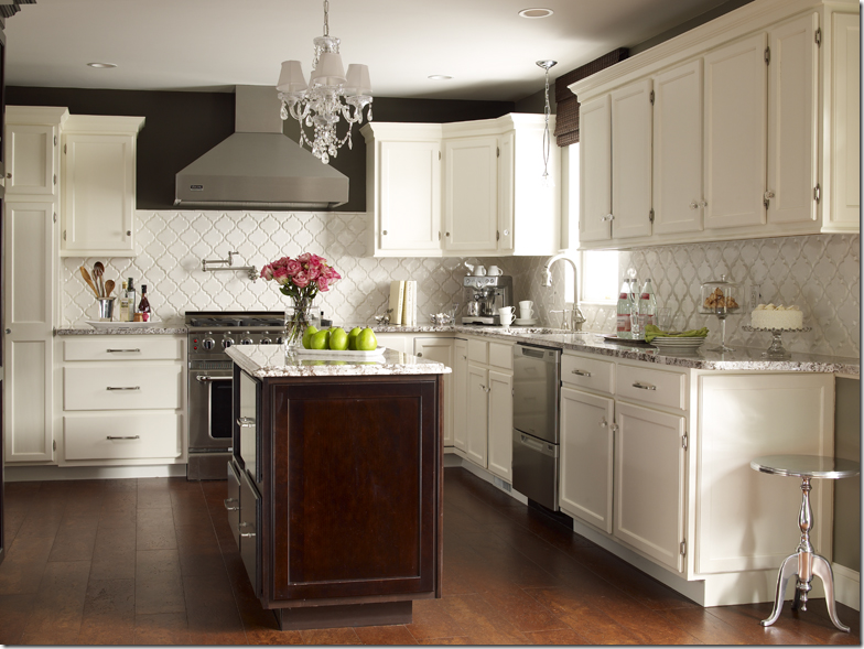
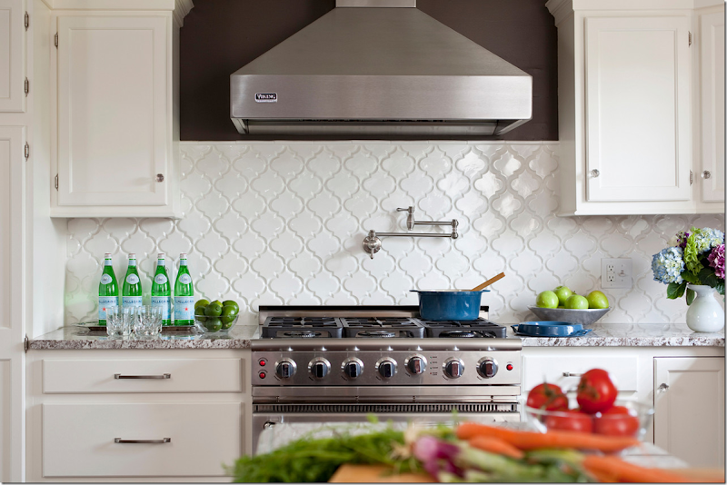
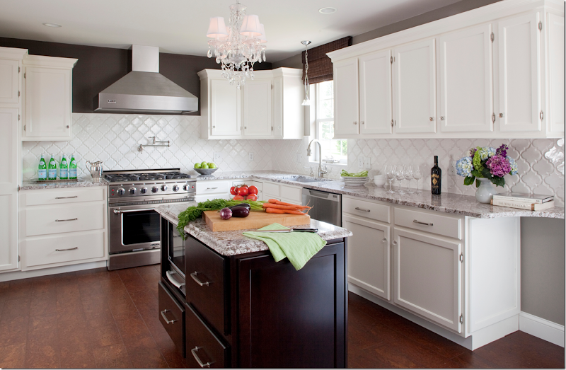
AFTER: the biggest change was the cabinets. Since they were in good condition – all they needed was a coat of white paint and new hardware. The biggest splurge was the new countertops – a Bianco Antico granite. Besides the granite, the white backsplash is the eye catcher here. In contrast to all the white paint, a band of dark brown (Italian Leather by Balspar) was painted around the tops of upper cabinets.
The backsplash is white tiles from Mission Stone and Tile called Beveled Arabesque Tile- Glossy White. Amazingly, the reader won the backsplash in a contest from Mission Stone and Tile!
Here you can see what a difference the backsplash makes. The white really pops next to the brown paint and the granite. Besides the granite, the other big splurge was the appliances – a new professional styled range and a built in refrigerator by Thermadore.
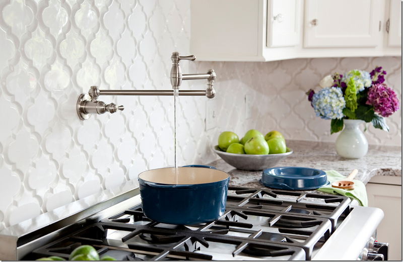
Above the range, the homeowners added a convenient pot filler. I love this picture, it’s amazing how good a few apples, limes and bottles of water can look!!!
Pot fillers are so convenient.
New plumbing and a sink were added, along with a pendant light by Elk Lighting.
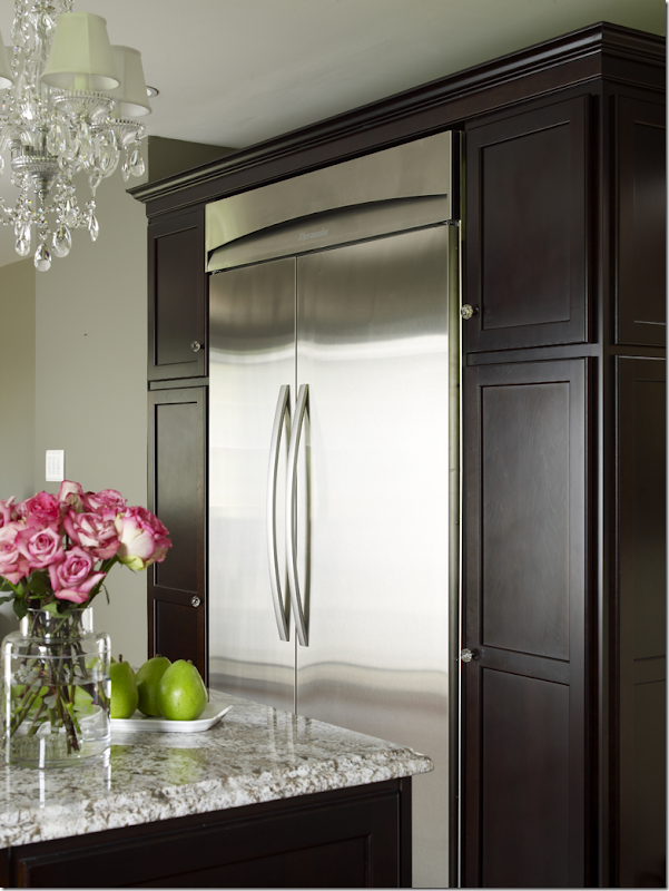
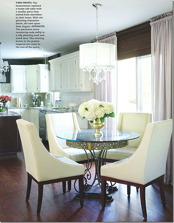
The built in refrigerator from Thermadore was added across from the island. The cabinets were painted in the same dark brown. The crystal chandelier adds sparkle and glamour to the room. Beautiful photography by the great Tria Giovan.
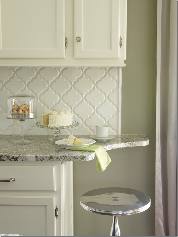
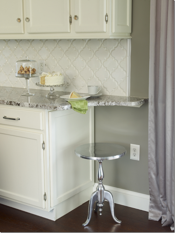
Instead of just ending the countertop – it was extended, adding a space for the reader to sit and have a cup of morning coffee.
If you have the space for this – I think this is a great idea!!
The short wall between the breakfast area and family room was removed – making for a smooth, open transition. Notice how perfectly executed her curtains are: no dead space and the perfect shade color which matches the brown paint on the walls.
Finally, the most amazing thing is the floors. No, it’s not wood, it’s cork! The reader saved a lot of money by using cork, plus it’s a great product for the kitchen because it’s easy on the feet. I would have sworn this was wood!
A huge thanks to the homeowner for inviting us into her kitchen and to stylist, Bonnie Broten.
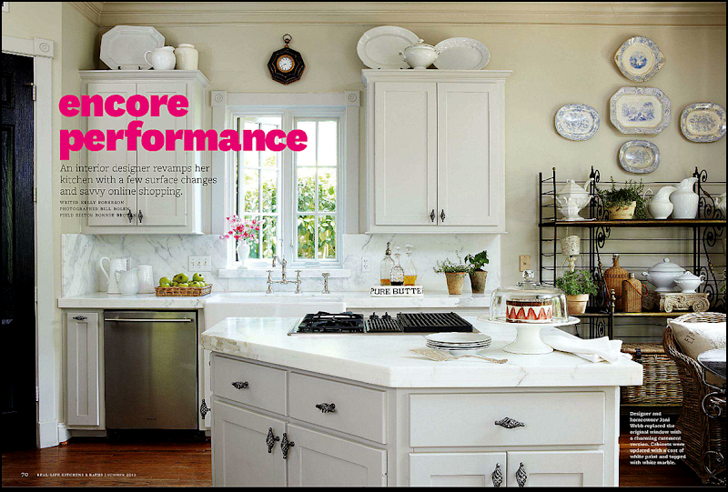
While perusing the magazine the reader’s kitchen was in, another article caught me eye, maybe because it said it was a blogger’s kitchen!!!
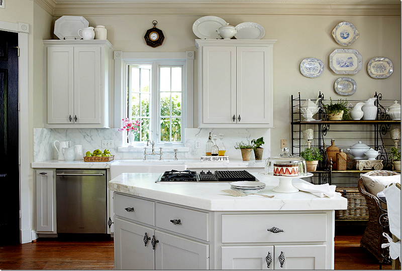
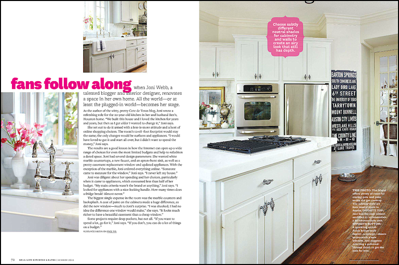
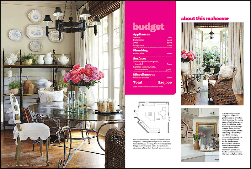
Well, will you look at that! I’d know that kitchen anywhere!! Of course it never looks this good or styled in real life, but that’s why they pay stylist Bonnie Broten the big bucks. Photography by Bill Bolen. The baker’s rack was my mother’s – and it’s antique. It’s rather short which is why I added the blue and white platters above it. Usually there is a small flatscreen on the middle shelf, but we took that out for the photoshoot. It looks so much better without it – I’d love to do away with it altogether.
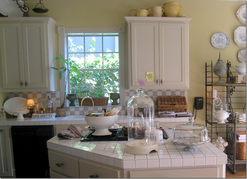
Here’s the original shot without the magazine’s writing all over it – notice on the right, the slipcovered chair was removed for the magazine – too cluttered looking, I suppose.
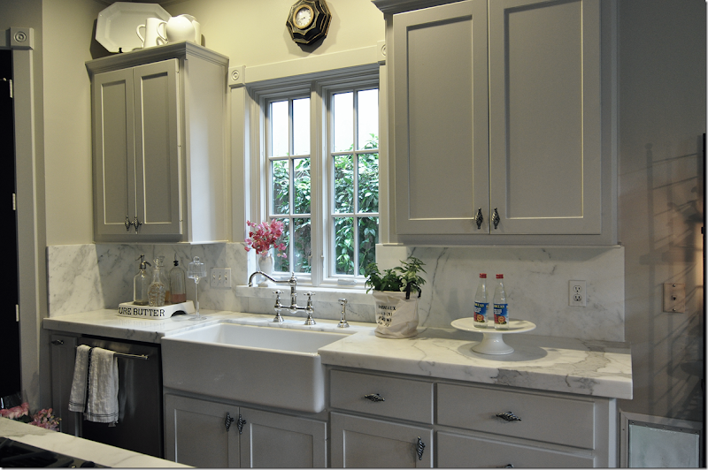
BEFORE: UGGH!! White square tiles and taupe and white backsplash, yellow walls, black appliances, white sink, brass fixture, old cheap aluminum window. What a mess!
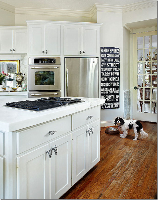
The second page – shows the other side of the kitchen. I love how the writing covers up the worn stain on my wood floors. This is where it is the worst in my house – in the kitchen – and in front of the sink and pantry. I bought that subway sign at Mecox for Christmas for Ben’s office. It never made it there. It lists all the great places in Austin, Texas – Ben is a huge longhorn fan. There is actually an ugly Ozarka water cooler that usually sits in front of it. But, of course, that didn’t make it into the magazine.
Poor Sammie Jo didn’t make the final cut. She was deleted from the picture in the magazine. She’s probably wondering where the water cooler went to. Oy, that floor! I have to do something about it, asap!!
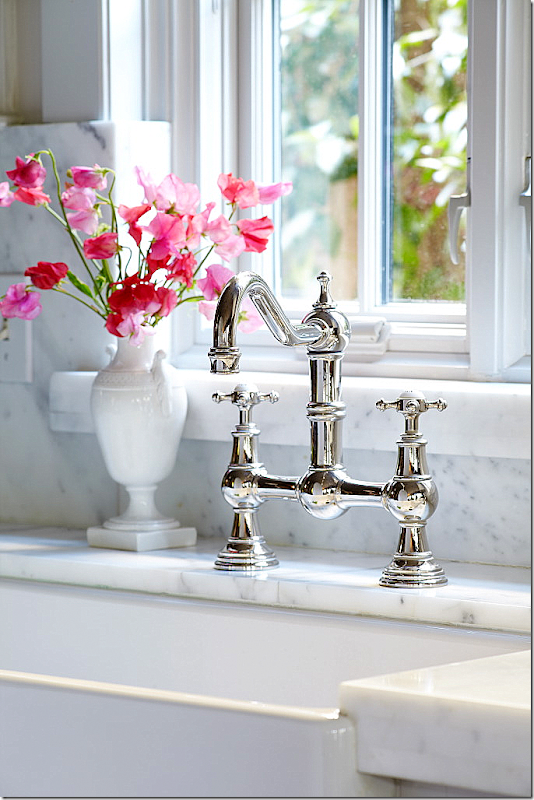
My three favorite things in my kitchen: my farm sink, the faucet in polished nickel, and the new casement window. That pretty white vase is another hand-me-down from my mother. (Oh, my sister Cathy is going to be reading this and saying – I want that!!!)
And in this picture, we opened the window for romantic atmosphere. HA-HA!! Probably to take your attention away from those floors!
The next page shows the breakfast area and the floor plan. I love the way the table looks. The editor wanted the old and new chairs mixed, so we drug one of the old antique slipcovered chairs out from the garage to mix with the Kooboo chairs that I use now. I do think they look cute mixed together. I know, I see it. Guess what I am talking about. Uggh.
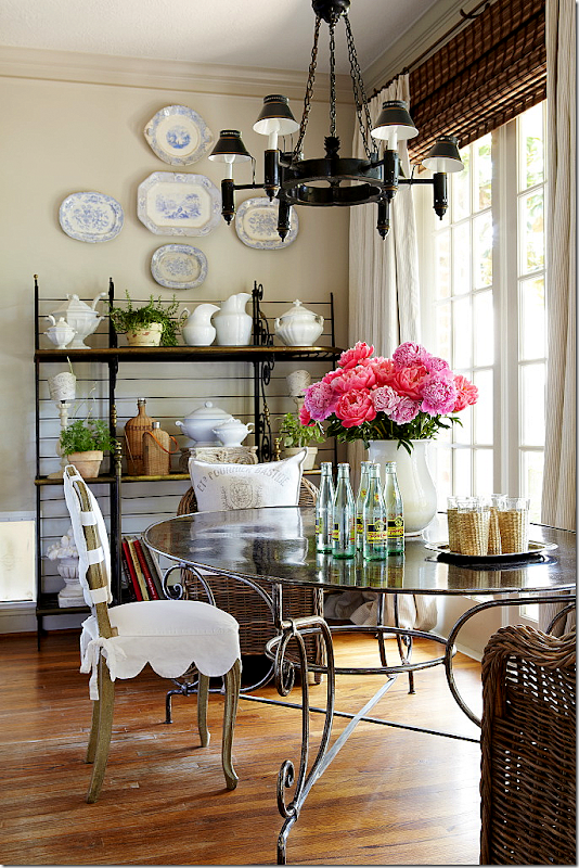
Here, you can see the doggie door to the left of the baker’s rack. The chandelier is another hand me down – from, you can only guess! I am cracking up at how much I have that is handed down!! Well, I did buy the table and chairs myself. This tole chandelier used to be in my dining room, but I moved it here when I got my new dining room chandy and the old one in my breakfast room went to my mother-in-law’s house. Move em in and move em out. I love the way Bonnie styled the baker’s rack and the table top.
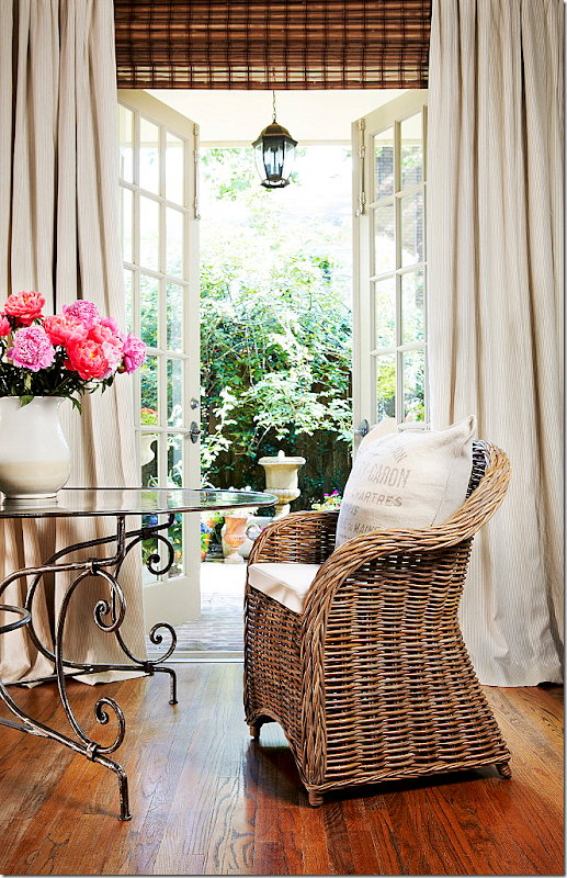
Now, this picture was a total cheat. Along the back wall of my house, there are five French doors – but only the center one actually opens. So to make it look like the one near the table opens, we moved the table in front of the center door. It really does create a much prettier picture – and now I wish I had the ability to open the door in my breakfast room! This is my favorite picture from the shoot. You can actually see the pin stripes in the curtains for once. And those lanterns on the porch – there are five of them – one in front of each French door. We used to have ceiling fans out there but they rotted, so we bought these lanterns. I bought them years ago before I was really into lanterns – today I would buy much larger ones than these. But, truthfully, now that I remember, at that time, I couldn’t afford the bigger size!!! The curved base of that table looks pretty here. Usually it’s hard to see with the chairs in front of it. OK – this is how my floors look everywhere else. Not as bad as in those spots in the kitchen.
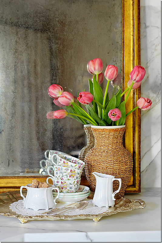
Bonnie worked on styling this corner for about an hour. Usually, this is my bar and it’s filled with bottles and glasses and is more cluttered. Also, the mirror is not usually here, although it does look pretty. My mother, two aunts, my sister Cathy, and myself all have the same china – shown here. We have about a billion place settings if we put it all together. It’s pretty – pink and green with a celadon border. I think that’s a great idea – if everyone in your family cooperates and buys the same china. I think we seriously could have a small wedding and use all of our china. That candy jar is an old jar inherited from you-know-who! More laughing!! And through the bar – you can see the staircase. Usually on this bar – there are two lamps from Aidan Gray, but those were removed for the shoot.
Here are a few detail shots that weren’t used in the story. Another really pretty photograph.
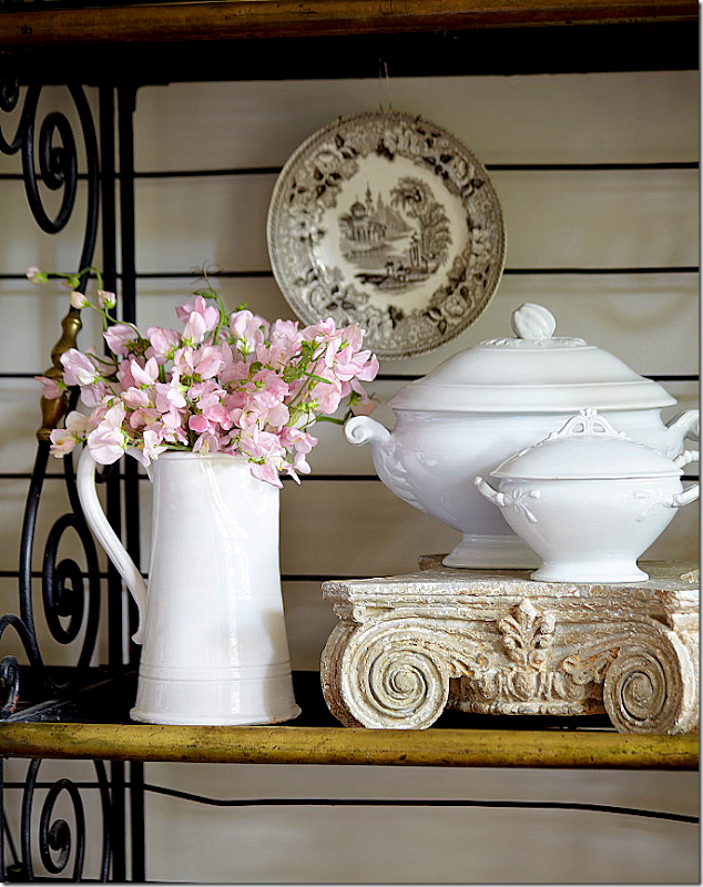
A detail shot of the baker’s rack with the white ironstone tureens. This picture also wasn’t used.
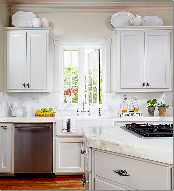
And this shot wasn’t used. The kitchen looks so white here – but it’s really gray – gray cabinets and gray walls.
When Ben read the magazine article, his first comment was – wow – these pictures look so much better than the kitchen actually does! And it’s true – the coloring looks better in print (especially compared to how it looks online. In the magazine, these pictures look even better.) Between the styling and the brightness, the photographs don’t really show the reality of the kitchen. Everything looks so crisp and in focus, while in real life, it’s more soft and darker.
I took this picture on that day – and the lighting is more realistic here. This shows a styling scene that was discarded. Bonnie didn’t like it so she started over and completely redid it.
And here is the mess that happens when you have a photoshoot. Everything is cleared out from one room and placed in another room. That’s Bonnie on the right and her daughter who assisted on this shoot – on the left. Georgie, as usual, is hiding from the camera. I am always exhausted after a photoshoot, but Bonnie is just fine! I don’t know where she gets her strength from, but she is amazing. If you ever get an email or call from a Bonnie Broten asking to photograph you house – yes, it’s legitimate. I’ve gotten so many emails over the years from people who have shown their house or kitchen on this blog and then gotten a call from Bonnie. It’s always the same question – “is this for real?” Yes, it is.
Thanks again to the homeowner, to Bonnie and to the photographers Tria and Bill.
P.S. If you have turned in pictures of your kitchen or house, please have patience. I will get to them one day!! Also, if you haven’t turned in photographs of your house or kitchen – please do! I’m still accepting entrants for the Readers Houses/Kitchens series.
Thursday, 31 May 2012
READERS KITCHENS SERIES
Posted on 18:16 by Unknown
Monday, 28 May 2012
The Pink Ribbon House - 2012
Posted on 02:38 by Unknown
I am thrilled to be able to show these pictures today of the Pink Ribbon House – 2012. A huge thank you goes to Leslie Sinclair of Segreto Finishes who was gracious enough to share the these gorgeous photographs (photographer is Wade Blissard at http://www.shooterwade.com) with me. Leslie has been a huge presence at the Pink Ribbon House, which is a collaborative philanthropic endeavor dedicated to raising both funds and awareness for breast cancer research AND patient care at the Lester and Sue Smith Breast Center at Baylor College of Medicine, located in Houston, Texas. Established in 2003 by the Lester and Sue Smith Breast Center Advisory Council, the Pink Ribbon House project has raised nearly $2.5 million for the Smith Breast Center.Leslie, a wife and mother of three children, who also runs her own decorative paint business, Segreto Finishes, tells why she has been so active with the Pink Ribbon House:
When I was pregnant with my third child, Samantha, now 18, a lump was discovered in my breast. Since one of my grandmothers had gotten a double mastectomy, I was definitely scared. I immediately rushed in to get an ultrasound that day and then a biopsy the following day, which I knew meant bad news. Rather than receiving treatment and having it removed right away as suggested, I decided to continue the pregnancy, watch the tumor and have it taken out after the first trimester when the surgery was safer for the baby. After the operation, I was extremely lucky that the tumor turned out to be benign. The research for breast cancer is such an important cause for so many women - it effects our daughters, our mothers, and ourselves. The Pink Ribbon House not only raises money for the cause, but also provides one of Houston's best designer showcases.
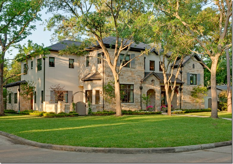
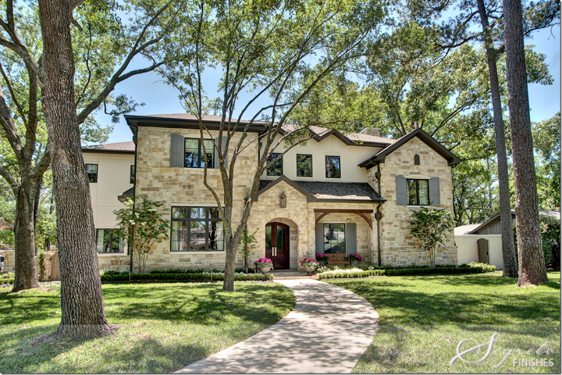
Every other year, a team of interior designers partner up with an architect and builder to create the Pink Ribbon House. This year, the builder is Levitt Partnership and the architect is Hollenbeck Architects. This is the first year that the Pink Ribbon House was not built on spec, but rather it was built for the family who is now living in it. Located in Memorial’s Hunters Creek Village, the original house that stood on the property was donated to Habitat For Humanity.The house is over 5,000 sq. feet, with five bedrooms and 5 1/2 bathrooms, 2 studies, and three fireplaces. The tour took place earlier this month – so if you were unable to attend or live out of town, you can now enjoy seeing the showcase here.
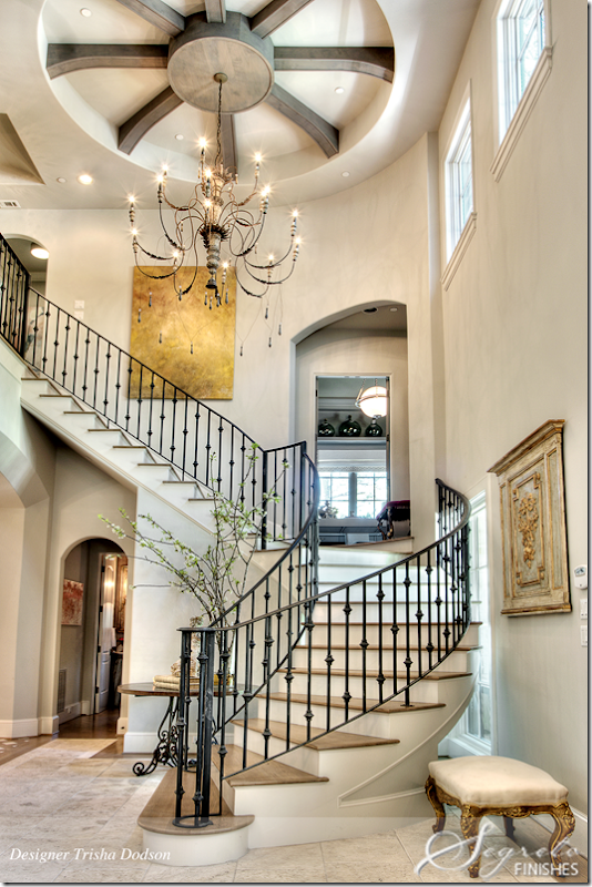
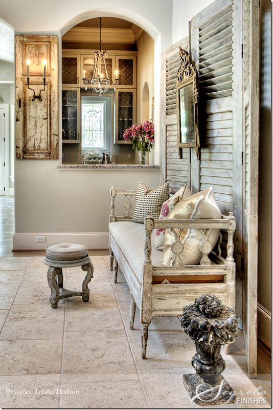
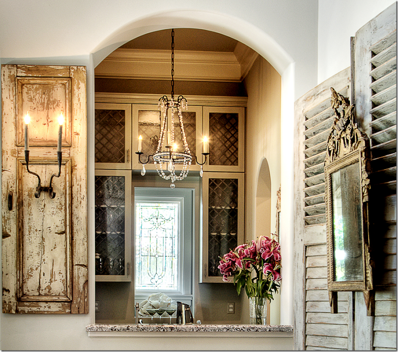
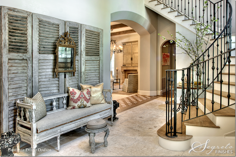
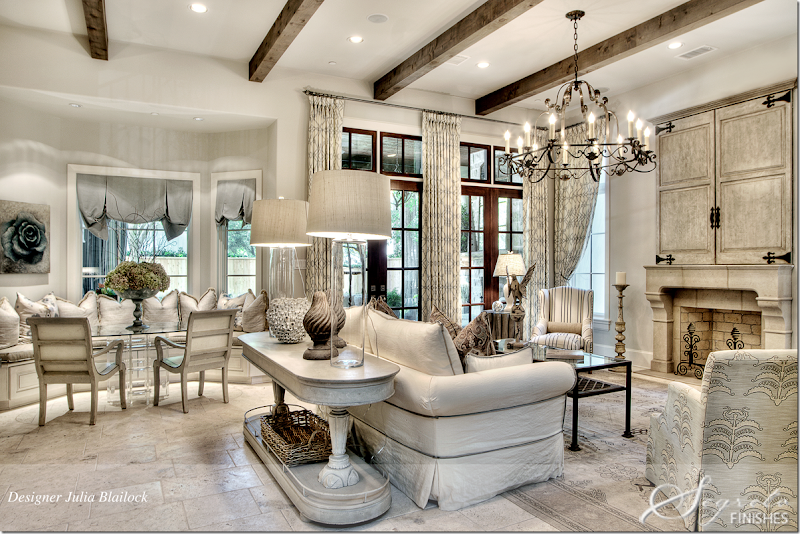
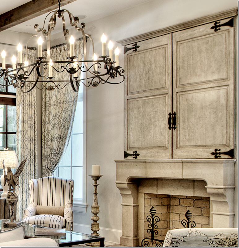
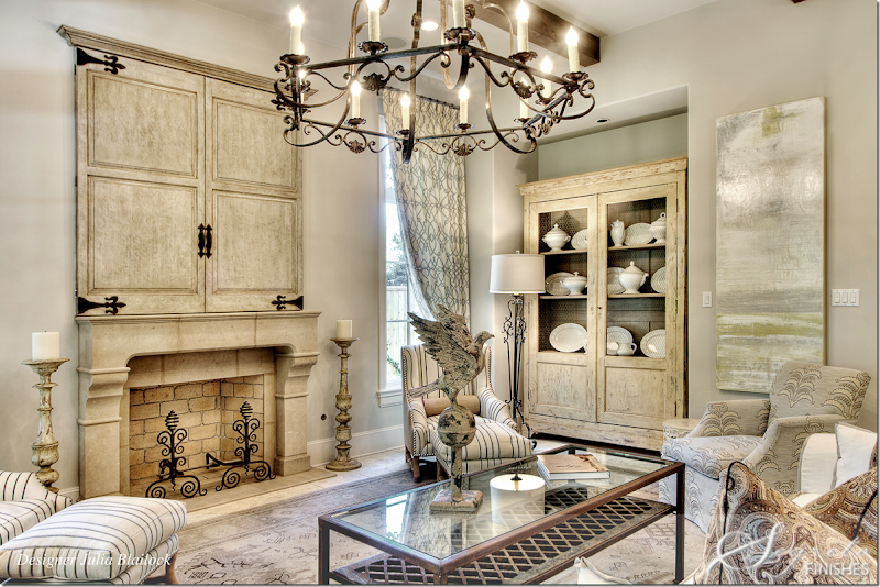
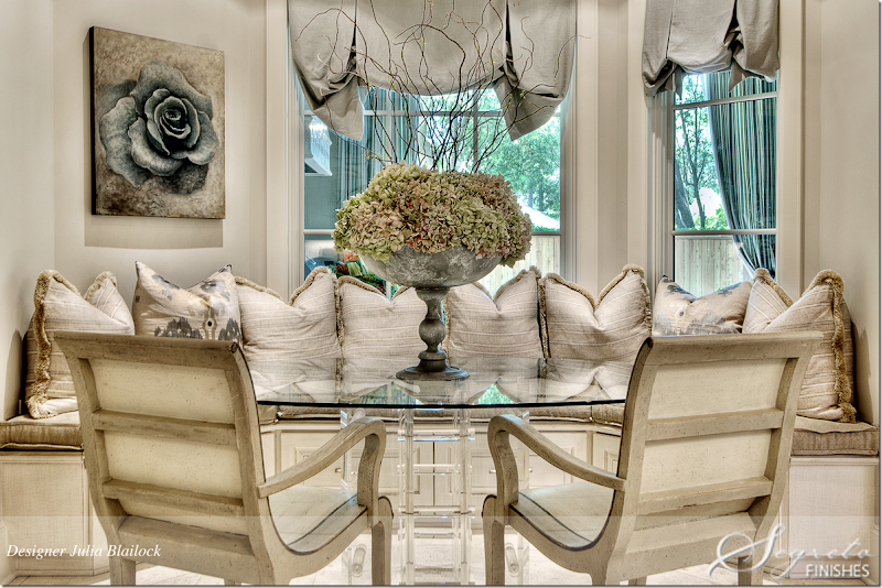
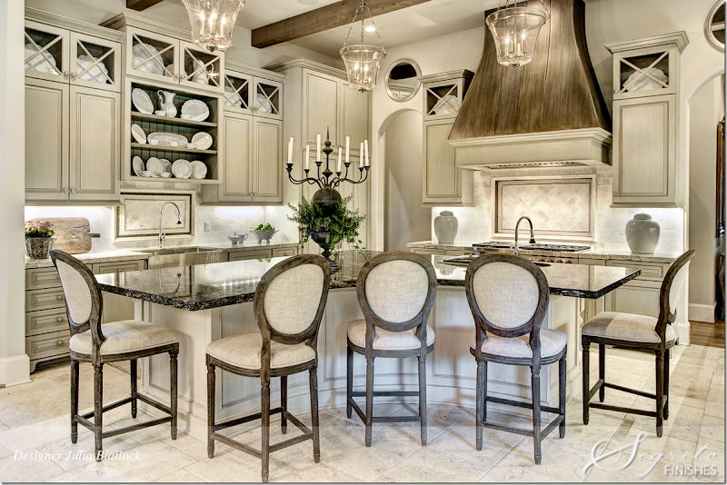
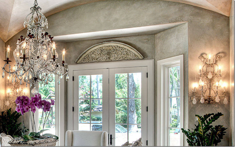
The façade is a combination of stone and stucco with French styled shutters in gray. To the far left is a side courtyard that leads to the dining room.The two story entrance is dominated by the winding staircase. Decorator for this room is Trisha Dodson. The stairs lead to a study that is between the first and second floors. The chandelier is the homeowners.I love antique shutters used as a backdrop. Such a pretty chandelier in the wet bar.A close of the wet bar with its leaded glass window. Such a pretty picture!Furnishings include an antique settee, wood carved panel and mirror from Joyce Horn and shutters, pillows, and stool from Vieux. Painting from MAI. Past the entry is the family room and kitchen. Notice the wood and stone threshold between the family room and entry hall.The family room and kitchen and back patio were all designed by Julie Blailock. Between the two spaces is a window seat and and dining table. A large console behind the sofa divides the two areas. A focal point is the fireplace with large wood doors that hide the flatscreen. Segreto Finishes added a gesso textured finish to the doors, then followed it up with layers of glaze.Close up of the doors that Segreto created. Love that black and white chair.The fireplace is Leuters stone from Materials Marketing. Furniture in this room came from Carl Moore Antiques, Quatrine Washable Furniture, and Boxwood. The carpet is from Matt Camron Rugs. The linen curtains are Pindler and Pindler. The art work came from Segreto Art Gallery.The breakfast table is glass topped and sits in front of the window seat. The rose painting is from Segreto Art Gallery.Looking from the kitchen back into the family room. Through the arches on the right is the entry hall. Additional seating is available around the curved counter.Julie Blailock didn’t have the working budget for a metal hood, so she had one built out of wood, which Segreto painted, first black, then they added layers of metallic paint to achieve a worn metal patina. The cabinets were painted a custom color then glazed by Segreto to give them a furniture quality finished look. And I can attest - Leslie’s cabinet treatments really do look like expensive furniture! Gorgeous! The countertop is Luna Nero and the island is Bianco Romano. The backsplash is tumbled travertine and Ken Mason handpainted ceramic tile with polished sable mosaic accent all from Materials Marketing.
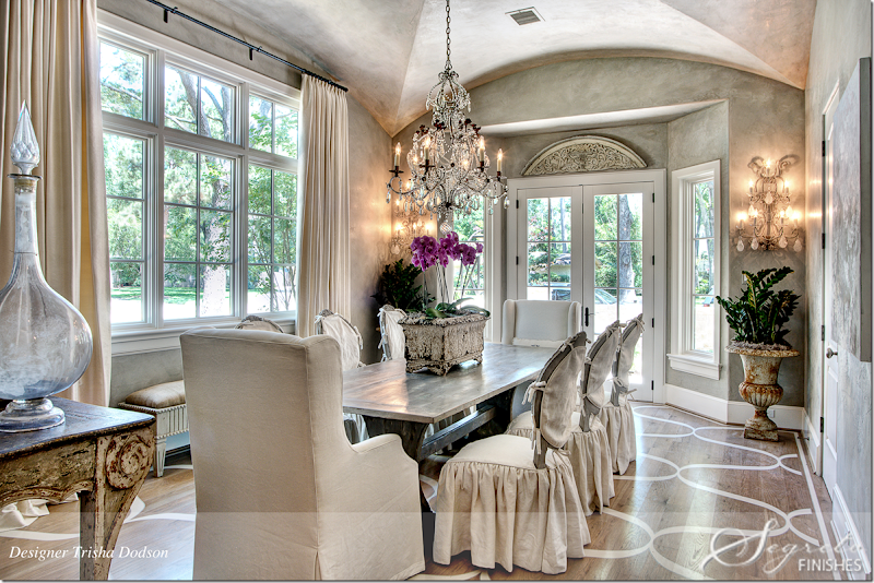
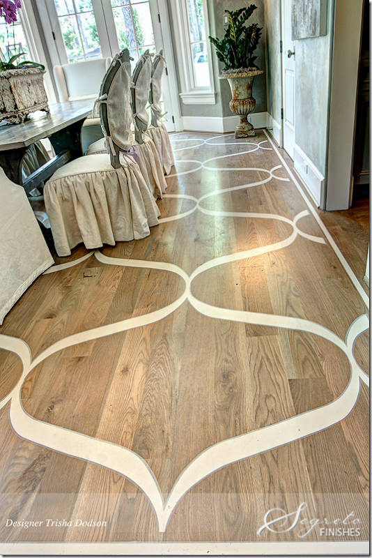
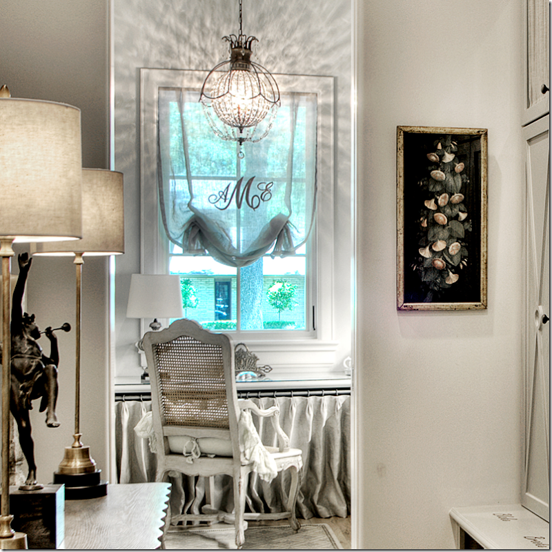
Closeup of the cabinets – love those Xs!!To the right of the front entry hall is the formal dining room, which overlooks a private, side courtyard that is surrounded by a short stone wall. Trisha Dodson, who created the entry hall also designed the dining room. Notice the beautiful ceiling. The table is from Vieux and the darling slipcovered chairs are from Joseph Company. I love the way Dodson designed the slips on these chairs! Painting, chandelier, sconces, and accessories all came from MAI. The buffet is from Joyce Horn Antiques. Curtains are made of Kravet silk by Heines Custom Draperies. The beautiful wall and ceiling treatment is plaster – applied by Segreto..Both the chandelier and sconces are beautiful!!The homeowner has three young children and wanted the look of a rug without a rug. Floors were first stained then Segreto painted the design with Sherwin Williams acrylic floor paint, which was then coated with two layers of polyurethane.Molly Oshman designed the mudroom and lady’s home office. I love this space with its linen covered cabinets! So cute!! The office has a chandelier and the window shade is monogrammed. In the mud room, Segreto painted each person’s name in car enamel paint – the names can be seen under each of their lockers. Baskets in the cubbies are for their shoes. What a great idea!!Close up of the office behind the mud room. Love the shade with the monogrammed.
The second office is located between the first and second floors. Notice the wood cabinet doors which are made from old barn wood – and designed by Julie Dodson. Dodson also custom designed the lacquered desk which was made by Joseph Company who also made the chairs. The fuchsia pillow fabric is Manuel Canovas. Curtains by Heines Draperies are made of Donghia fabric. Accessories are from MAI, Vieux and Watkins Culver and the rug came from Creative Flooring.
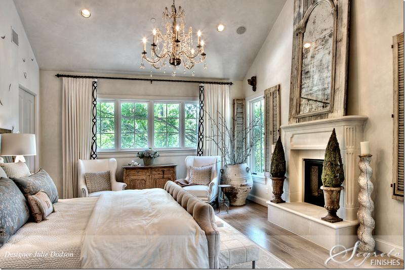
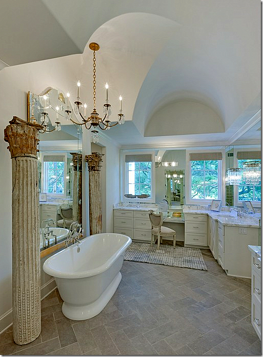
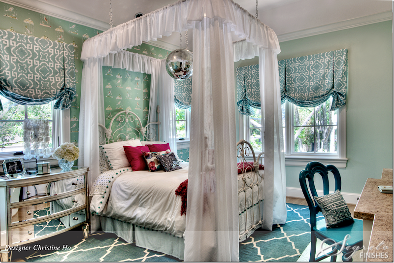
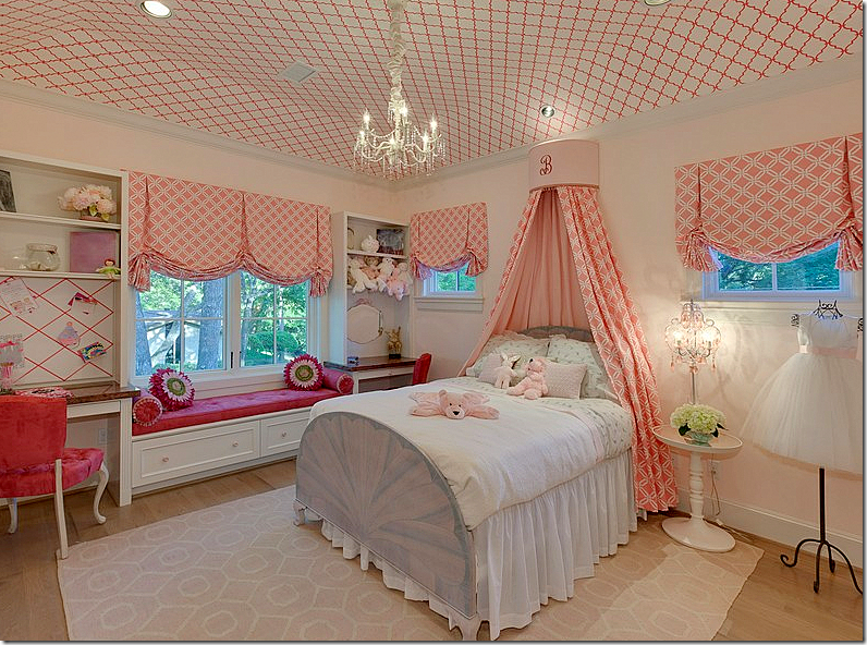
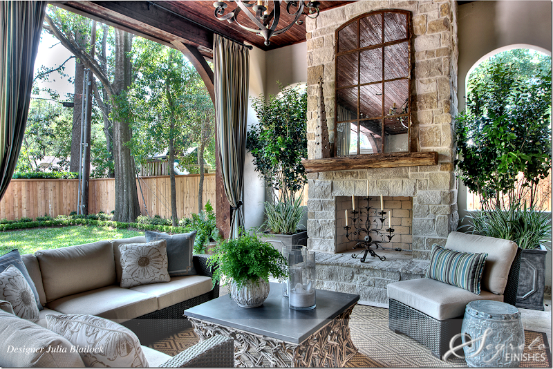
The master bedroom suite was designed by Julie Dodson. The focal point of the room is the bed – with Plush Home bedding. The accent pillows wear George Cameron Nash fabric. The wallpaper behind the bed is Fromental at David Sutherland Showrooms. Joseph Company custom made the chairs and the nightstands. Curtains were made by Heines Custom Draperies and embroidered by Michael Savoia of Villa Savoia, who donated his time to the Pink Ribbon House. Creative Flooring provided the rug. Accessories are from Chateau Domingue (shutters) and Watkins Culver. Mirror from Joyce Horn. Julie found the chandelier and lamps at Round Top. The chest is from MAI.Another view of the bedroom – I love the shutters on the windows. Segreto plastered the walls in a smooth finish diamond plaster to blend with the silk wallpaper. This treatment gives the walls a finish that looks like silk.In the master bath, Julie added columns from Joyce Horn and the rug came from Creative Flooring.Here’s another view of the bathroom – you can see the beautiful ceiling and chandelier here.Christine Ho of Cho Interiors designed the baby’s room. The rocker is the baby’s great grandfather’s! The paint is SW Hinting Blue. The chandelier came from Restoration Hardware and the hot air balloons are from Doodles. Drapery fabrication is by DJ Drapery. Behind the bed, Segreto painted the wall to look like quilted fabric.Christine Ho also designed the eldest girl’s bedroom – with its white iron bed from her great great grandmother!!! The bedding is Pottery Barn Kids. The wall is painted SW Slow Green and the wallpaper is from Wallcoverings International. Drapery fabric and sheers is Duralee and fabrication is by DJ Drapery. Notice the disco ball!!!This daughter’s room is in hot pink – with a wallpapered ceiling. Darling!! I love her fancy dress on the wire dress form.And finally, the back patio was designed by Julia Blailock to tie in with the family room and kitchen. All weather wicker sectional surround a zinc topped coffee table. And, there’s a beautiful stone fireplace – one of three in the house. Julia added a rug to make it more cozy. I’d be out here with a fire going all night long, it’s so romantic. Notice the curtains that make it even more romantic. So beautiful!!!Here is a complete roster of the interior designers who worked on the Pink Ribbon House this year: Valerie Cook of Valerie Cook Design Inc.; Julia Blailock and Rachel Reppond of Blailock Design; Belinda Bennett, Lauren Amber Prestenbach and Amy Vonderau of Bennett Design Group; Cho Interiors’ Christine Ho; Julie Dodson and Trisha Dodson of Dodson & Daughter; Mollie and Molly Interior Design’s Mollie Oshman and the late Molly Sullivan Levitt, wife of Zach Levitt, partner in the cause's construction company and of course Leslie Sinclair of Segreto Finishes.A HUGE thank you to Leslie for providing these beautiful photographs. On her blog, Leslie has written extensively about the other Pink Ribbon Houses through the years – to read those blog stories, go here:
Subscribe to:
Comments (Atom)


