Recently, interior designer Cheryl Ketner from Plano, Texas submitted her kitchen for the Readers Kitchen Series. When I looked at her photographs, I was intrigued. Most kitchens that have been submitted have been white or some variation of white. This kitchen was red! Through the years I’ve been accused of showing only houses with gray paint and white slipcovers. I thought that this would be a perfect departure from that norm. I asked Cheryl to send more photographs of her house and was pleased to see that it was a total renovation – taken from plain builders grade to custom. I love total redos – I think they are a great help to those of you who are currently undergoing a renovation. Here are the before and after pictures of the “Red House.” Enjoy!
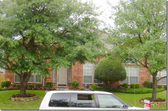
BEFORE: The house in Plano, Texas was a typical red brick home when the Ketners purchased it. Cheryl, an interior designer, sometimes works on projects with her husband Kerry, who is a contractor. Of course, this was one job they both were heavily involved in – their own house!
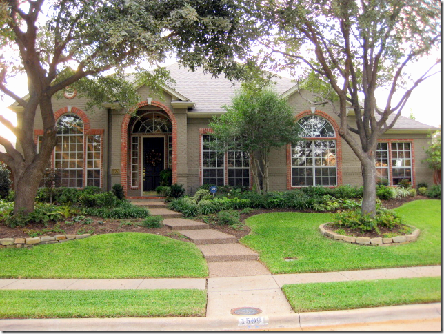
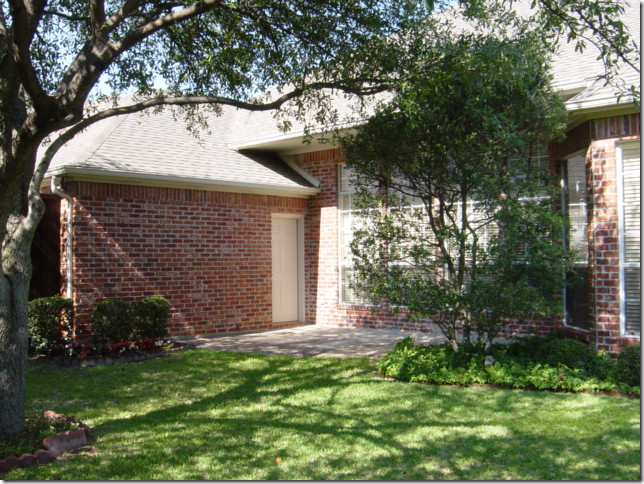
AFTER: in an unusual twist – the brick was painted a dark taupe color, but a row of red brick was left exposed around the windows – which highlight their arched shapes. This is such a great idea. Also, the trees were thinned out and the landscaped beds were greatly enlarged, creating much prettier curb appeal.
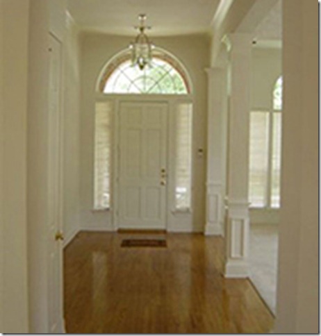
BEFORE The Entry Hall: The house had good bones, pretty moldings and high ceilings. But, Cheryl loves bright colors. Builders grade cream paint would never do for her.
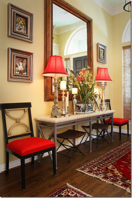
AFTER: Bright yellow paint fills the house. The moldings are painted white to highlight them. And red is introduced at the front door through the lampshades and chair fabric.
A variety of rugs cover the entry hall floor. Cheryl loves symmetry – as you can tell by this perfectly balanced vignette. I’m a symmetrical person too – you either are, or aren’t. Notice how the large mirror is the exact right size for this area.
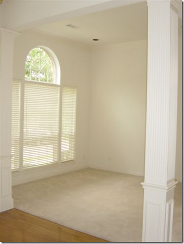
BEFORE: The living room and dining room are off to the left side when you enter. This room was carpeted.
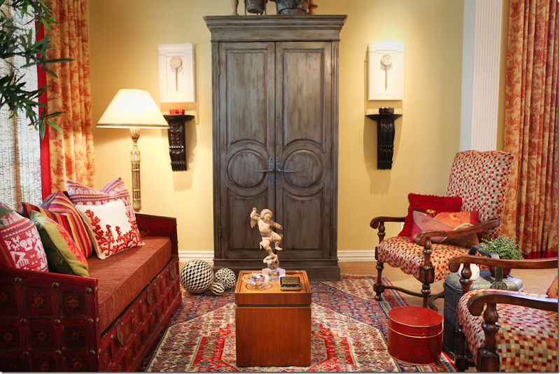
AFTER: The bright yellow room is now carpeted in wall to wall seagrass. Love that. An Oriental rug is layered over the seagrass. Red and yellow toile curtains hang in the living room and the dining room – to the right. A daybed takes the place of a regular sofa and the large armoire anchors the furniture arrangement.
The Ketners – Kerry and Cheryl. This is the only picture of the dining room – so you can see the homeowners too!!!! I wish we could see more of the room – the chandelier, and the table. Notice the elegant shades that are layered behind the curtains. Very pretty picture Cheryl!
BEFORE: The family room had a blah looking built in and was carpeted.
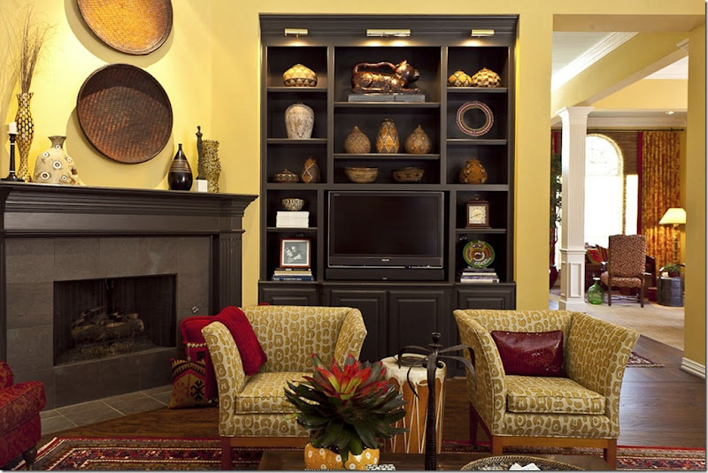
AFTER: The Ketners added hardwood floors in here and layered oriental rugs over them. Again, the walls are the same shade of yellow – makes for great continuity when all the public rooms are painted the same. Amazing – the bookcase looks brand new, but it was just painted black and lights were added to the top. Corner fireplaces can be tricky when arranging furniture – but Cheryl came up with the perfect solution.
Here you can see into the living room and dining room from this view. And you can see where Cheryl added lights to the bookcase – making them seem much more custom. Great idea. It also looks like crown molding may have been added to the bookcase too. The mantel was painted to match. Luckily, the tile surround was already dark and didn’t need to be changed.
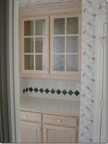
Before – The Butlers Pantry, between the dining room and kitchen, was stained the same as the bookcase.
TODAY: Fauxed black with red undertones, the paint completely customizes the pantry. Also new hardware updates it, along with seeded glass in the doors. All great ideas to emulate when updating cabinetry.
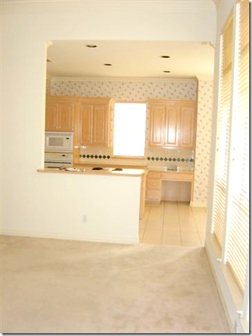
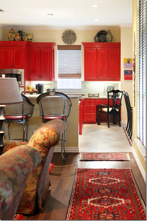
BEFORE: Looking from the family room into the kitchen, with more light stained cabinets.
AFTER: The bar’s countertop was extended to make it more usable. And new tile was added – placed diagonally, which helps expand the room.
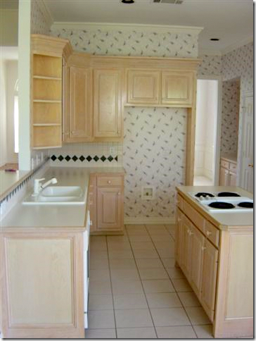
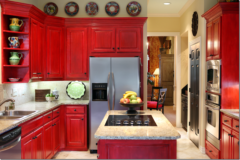
BEFORE: The footprint of the kitchen didn’t change at all. But, all the design elements did.
AFTER: New granite countertops and stainless appliances, along with a new tiled backsplash make the kitchen more custom. But, the biggest change is the red painted cabinets. They were fauxed to add more dimension to the paint job. New hardware was also added. The pantry door was painted black – a trick I like to do too. Who says a kitchen has to be white????
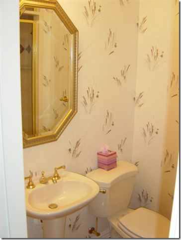
BEFORE: The powder room was nothing special.
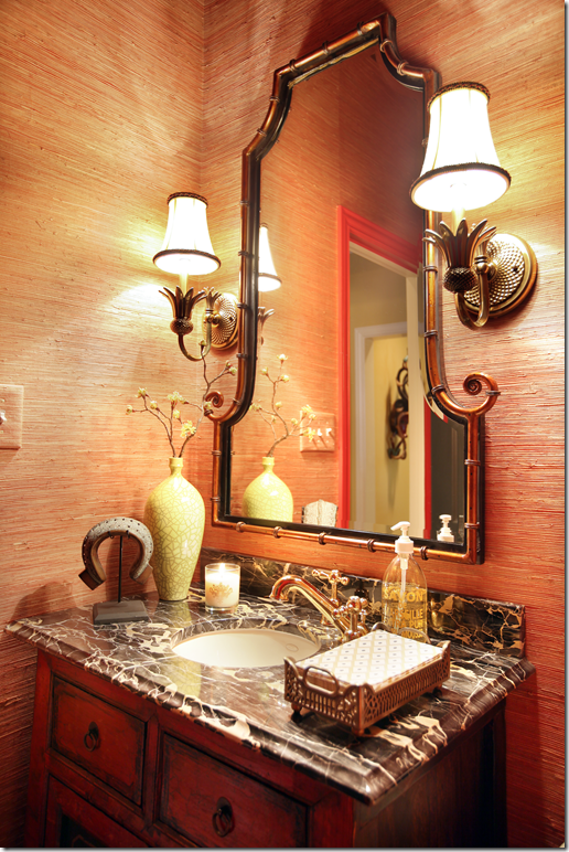
AFTER: It is now a little jewel box with richly veined marble and a red oriental cabinet. Grasscloth on the walls adds texture.
The Master Bedroom has the same paint – with a newly added textured carpet. Mismatched tables add interest. I really like the shades here – very pretty.
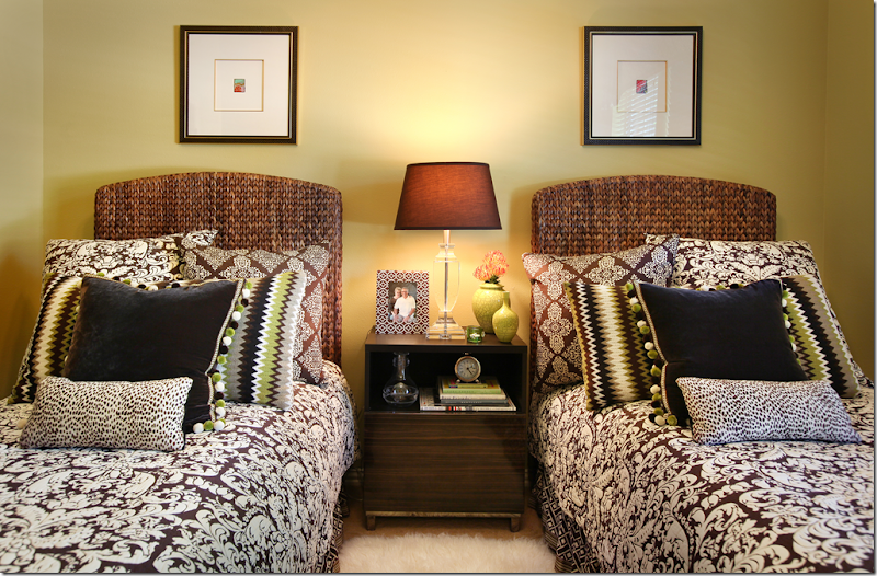
The guest room has brown and white bedding mixed in with greens and blacks. I love the touch of green.
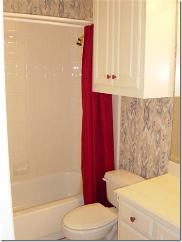
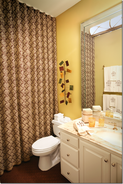
BEFORE: The guest bathroom.
AFTER: Two great ideas to update a 90s bath without breaking the bank. Remove the cabinet hanging over the toilet! And raise the shower curtain to the ceiling. It looks so much more custom when raised. Add a mirrored frame around the mirror and new marble countertops to take it a step further.
The office is dark brown and very dramatic. The light colored desk pops against the dark walls. Red pops up in the accessories and the fabrics.
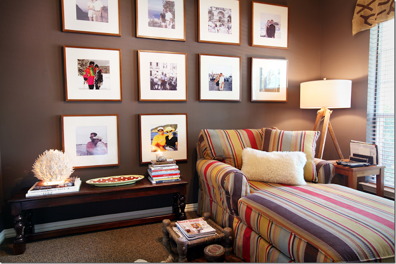
And here, in another room, the same dark walls are the perfect backdrop to the wall of art – another way to decorate without breaking the bank. Purchase identical frames and blow up your favorite family photos. The white mats really pop against the dark, brown walls. Again, red shows up in the fabric. Love that carpet.
BEFORE: The back yard – with the red brick.
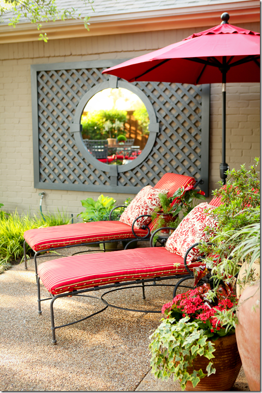
AFTER: With the brick painted a dark stone color – Cheryl added a mirrored trellis to the brick to create a focal point. All the outdoor furniture is covered in red and white fabrics – bringing the inside – outside. Another great way to add continuity to the design.
BEFORE: The back yard was all grass leading up to the fence.
AFTER: Now, instead of just grass, there is a large deck with benches that surround it. Again the red follows from the inside out.
I hope you have enjoyed looking at the Ketners colorful home! They took a rather bland house and turned it into a cozy, warm and inviting home – by painting it a bright yellow and using vibrant red throughout.
To read more about Cheryl, visit her web site HERE and to learn about Kerry’s contracting company, go HERE.
A million thanks to Cheryl and Kerry for inviting us to peek into their house!!!
Monday, 31 October 2011
AND NOW FOR SOMETHING COMPLETELY DIFFERENT: RED!
Friday, 28 October 2011
ONCE IN A LIFETIME EVENT: A TARA SHAW SALE
What? Did I hear that correctly?? A sale at Tara Shaw Antiques? YES!!!! Tara Shaw in Houston is hosting a “Once in a Lifetime Event” – a sale! Why Once in a Lifetime? Because Tara Shaw NEVER has sales. Never. Until now, that is. Emails went out to all their customers announcing the sale in Houston, starting Tuesday, November 1. BUT BUT BUT – if you read this, you can go early, before the crowds. For Cote de Texas readers, the sale starts this Saturday!!! Why the sale? The store in Houston will be moving to a new location – to be announced in the future. So, I suppose this is a cleaning out, the less to move, the better. The doors open Saurday at 10:00 am until 5:00 pm. AND, the store will be open on Monday. I can’t wait to see what’s for sale and how much discount there is. This is your chance, a once in a lifetime chance, to buy an important antique, at a discounted price. Tara sent over a few pictures of things that are on sale:
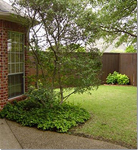
The front of the Houston shop. I love those huge pots for a porch. Beautiful!
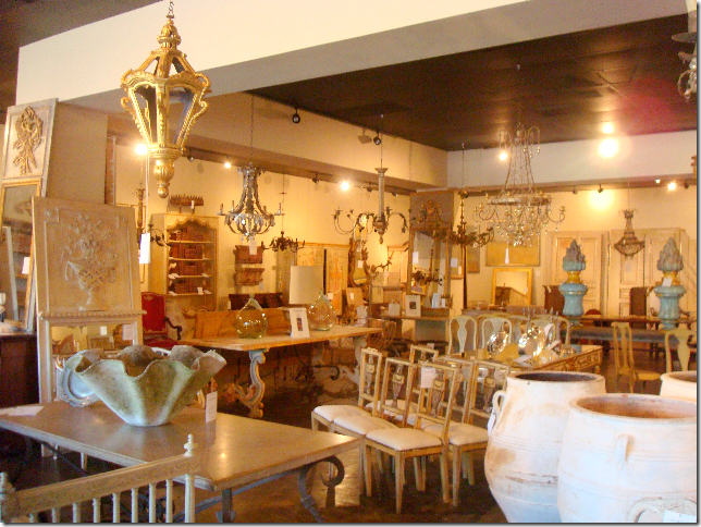
A view towards the back of the shop. Those two mirrors on the left look interesting. Hmmm. I see a lot of things I like.
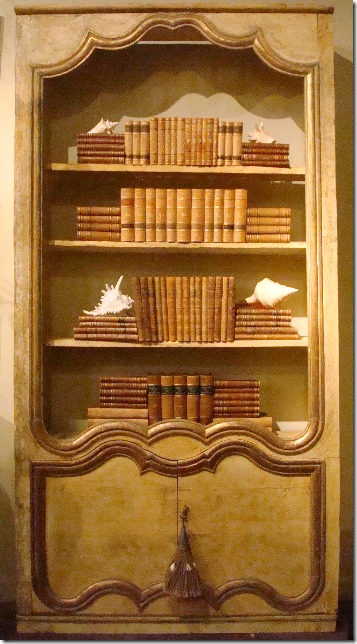
This bookcase is in the store and on sale.
This is a great piece for an entry, a dining room, or a family room – with a mirror and beautiful lamps.
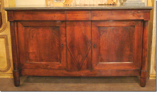
Beautiful!!! This piece is also in the Houston shop.
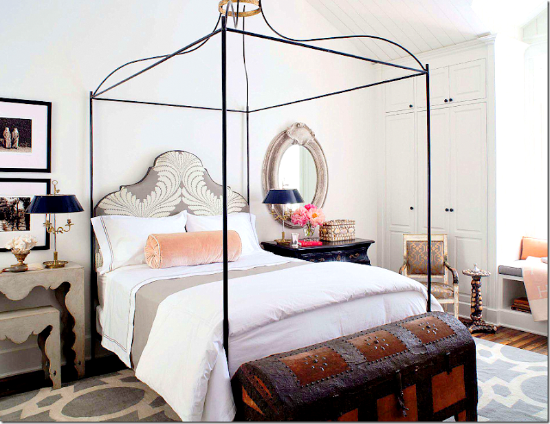
Tara Shaw’s star is on the rise. From the owner of a small antique shop dealing to the trade only, Tara is now a major player in the furniture business. Just recently, Tara Shaw opened showrooms in the Highpoint, New York and Atlanta markets to sell her line of exceptional reproduction furniture. When she started her line, Maison, in 2008, she had 46 items. Today, the line has grown to over 200 items and all wonderful, if you ask my opinion. Also exciting, Tara was the only non-Californian designer asked to design a room for the Veranda Showcase House designed by Windsor Smith. The focal point of the bedroom was the iron canopy bed from the Maison line. The side tables also came from Maison while the rest of the room was furnished with antiques from Tara Shaw.
Tara Shaw – Interior Design Project
A few years ago I first wrote about Tara Shaw’s arrival in Houston when she forced by Katrina to open a shop here because her New Orleans store was unable to accept a shipment. It was monumental – the first to-the-trade antique shop Houston had seen in ages. The prices were truly wholesale and very affordable. At her first shipment, I almost gave myself a heart attack. Seriously. I ended up at the cardiologist after I thought I had heart pains brought on by all the gorgeous antiques. To read that story, go HERE. While, there was nothing wrong with my heart, it was perfectly understandable why I was hyperventilating. I had never been exposed to so much for so little. Whew! Over the years, the policy changed, and Tara Shaw is now open to the public. I am thinking this sale will be reminiscent of those earlier to-the-trade only days! Through the years, at Tara Shaw, I have bought both for clients and myself. I love to see what’s she has in stock. I’m always perusing their 1st Dibs listing HERE and their web site to see what’s in store in either Houston or New Orleans.
In my own living room, my antique French chandelier came from Tara Shaw. I had waited for years to buy one, and finally found exactly what I wanted at Tara’s.
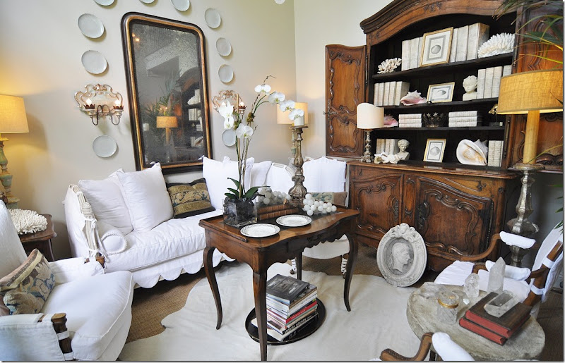
My antique French Buffet a deux came from Tara’s also. I had saved up money from my business and bought it all by myself. I was so proud! ha!! Inside, my collection of Masonware is on vacation for a while. Instead, I have a collection of shells and cream covered books, from Tara Shaw, of course!!!
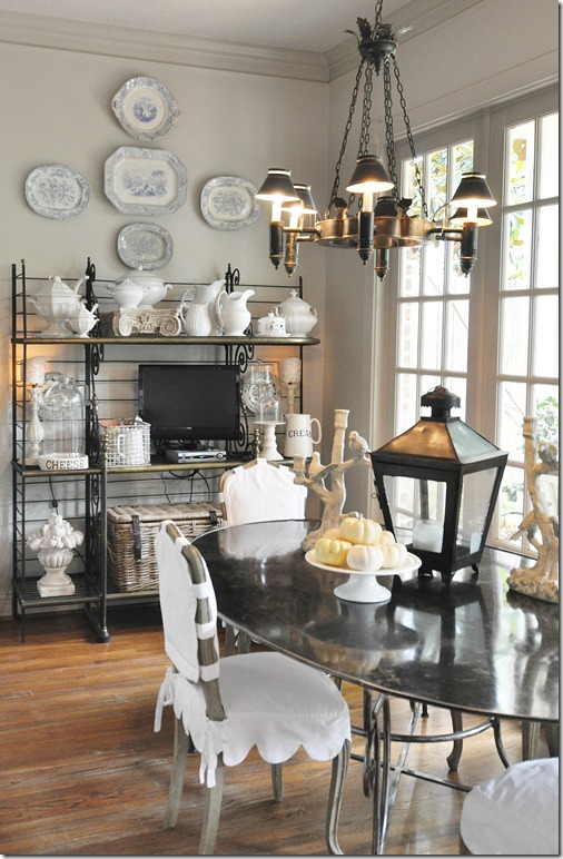
A few weeks ago, I went to Tara’s and bought a small collection of creamware plates – that I put on top of the table. The antique altar sticks are also from Tara, as are the reproduction sconces that flank the French door. There are very similar sconces in the Tara Shaw Maison line.
This pair of antique sconces also came from Tara – I would love to have a pair of tabletop lights just like these.
These four chairs came from Tara Shaw – I bought these at her grand opening when I gave myself a fake heart attack. Today, these chairs are on vacation in the Ga’Rage – while the kooboo chairs take their place. For the photoshoot that will be in the Kitchen Renovation magazine, Bonnie Broten styled the breakfast room showing both these chairs and the kooboo chairs together. It looked really cute, I wish I had enough room to have them both like that all the time!
In Elisabeth’s room, I bought this large mirror from the Tara Shaw Maison line – I love it. It’s a great reproduction and looks like an antique.
There are so many items in her Maison line that I love:
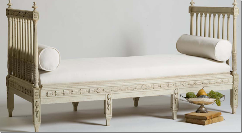
The Swedish day bed is a favorite from the Maison line. It’s perfect for a living room, a sitting room, even a bedroom. Love it!
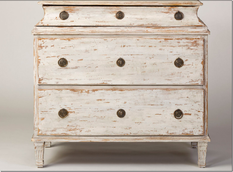
This Swedish chest would be beautiful as an end table in a living room or next to a bed. It really looks authentic. Swedish antiques are so expensive – and most reproductions are cheaply made. Maison really has beautiful pieces that are made so well and look so old.
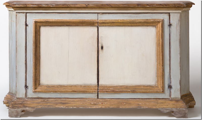
I am crazy over this new item in the Maison line. An Italian cabinet – I’m thinking I might need this in my entry hall. It’s so good looking. I love the barely blue paint next to the gilt.
Finally, another new item I am lusting after – these balustrade lamps with a parchment shade. Beautiful.
Don’t forget – doors open Saturday, Oct. 29th, at 10:00 at Tara Shaw, Houston, for a Once in a Lifetime sale!!!! Open to the public. Get there early and good luck – I hope you find something you can’t live without like I do every time I walk in that shop!!! And remember, the store will also be open on Monday.
For more information:
Houston Warehouse
1845a W. Alabama
Houston, TX 77098
t. 713-533-9744
f. 713-533-9749
Tuesday, 25 October 2011
INCREDIBLE RENOVATION–PART II
Last January, I showed the story entitled “Incredible Renovation” – about a Houston house, actually located in the suburb town of Sugarland, Texas. This 20 year old foreclosure had never been updated when the current owner, a single, empty-nester bought it. She made a few, key renovation decisions that drastically changed the look of the house: most notably, new hardwoods were laid everywhere, but the bedrooms, and a new kitchen island was built. Additionally, she retiled her bathroom, closed up a door leading from the dining room to the kitchen, removed some built-ins, and painted. The renovation took three weeks to complete – or 20 days to be exact. The transformation is astounding. So astounding, in fact, this story received over 200 comments!!!! I think it may hold the record for the most commented story ever on Cote de Texas.
When it was published, I sat back and listened to the pings of my computer’s email alert. The pings kept coming and coming and coming. I was stunned at how fast you commented and at how many of you felt the need to comment on the story. Of course, it wasn’t without controversy. What would the comment section on Cote de Texas be without controversy? Some of you refused to believe this renovation was done in just 20 days. Others argued why it was believable. It went back and forth between believers and non believers. There was even a thread on Garden Web where they discussed whether the owner did all the work herself!!! No, she didn’t perform any of the labor, but she also didn’t have a contractor or an interior designer. All the design decisions were made by her and a posse of close friends. The owner contracted all the laborers herself.
So, how was it all completed in such a short amount of time? The homeowner planned the renovation before she even closed on the house. She started purchasing items she knew she would need even before the house was hers. Once she gained entrance to it, all the tradesmen were ready to go – and many worked around the clock, late into the night. In the end, she moved in within a month of closing to a completely redone, fresh and beautiful new house.
The story caught the eye of magazine stylist extraordinaire Bonnie Broten. Bonnie freelances – producing stories for many of the titles you read, including all those owned by Meredith. Bonnie emailed me and said she had to have this house. True to her word, she came to Houston this summer, along with photographer Bill Bolin to style the house and take pictures. The story is in this month’s Renovation Style – The Before and After Issue. Also in this issue is New Hampshire blogger – For Love of A House. I thought it would be interesting to revisit this renovation story and show you all the pictures Bill took. Most ended up in the magazine, but not all did. There have been some decorating changes during the past year that I thought you also be interested in seeing. And if you are new to Cote de Texas, to read the original Incredible Renovation story – go HERE. Enjoy!!!
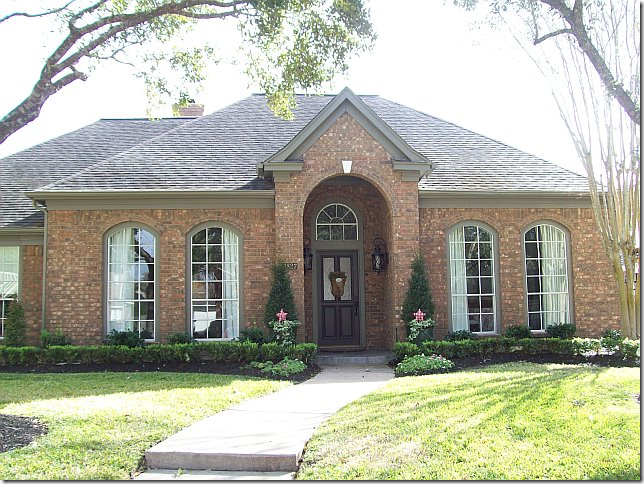
BEFORE: Twenty years old, the house had never been remodeled. The landscaping needed refreshing and pruning.
AFTER: The new homeowner opted for beds of box for a much neater look. Overgrown bushes were removed, and new trim paint in a dark khaki was painted over the former white.
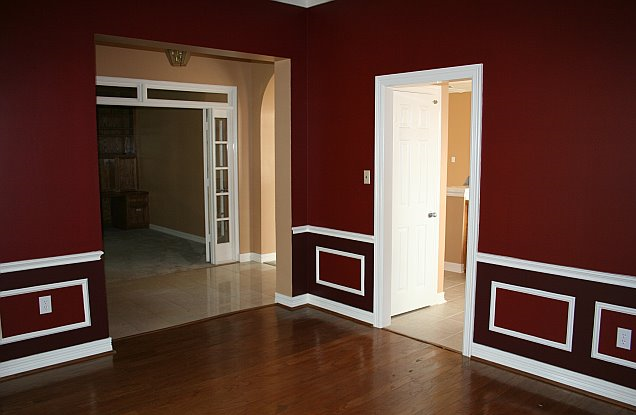
BEFORE: Upon entering, through French doors with a transom, the study had carpet and a wall of built-ins. These built-ins were quickly removed and hardwood floors were laid The ceiling fan was another casualty.
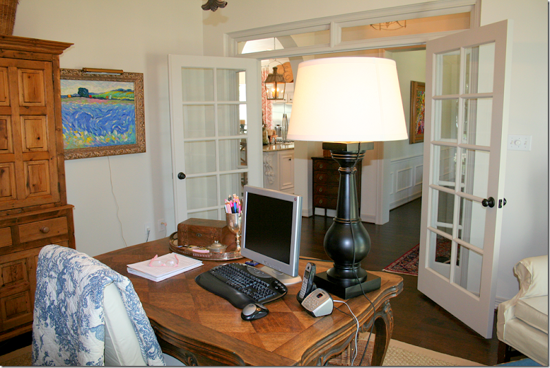
AFTER: Looking through the French door, the room is now the office for the homeowner who works from her house.
Looking through the French doors into the office. Antique furniture takes the place of the built-ins. The homeowner loves to go to Round Top where many of her accessories were collected over time. An iron light fixture takes the place of the ceiling fan.
·
RENOVATION STYLE: These photographs for the magazine were taken by Bill Bolin and styled and produced by Bonnie Broten. Changes include – a more substantial slipcovered desk chair and a new lamp. Of course, the shelves were also tweeked for the photograph. In this photo, you can see her linen curtains with their blue and white ribbon trim. Bill and Bonnie are quite a team – they are very professional and talented. Notice the beautiful lighting – with the sun streaming through the windows.
BEFORE: Across the entry hall is the dining room. Here you can see the old tile that was in the kitchen and hallway, which was replaced with hardwoods. The door to the kitchen was closed off to make more counter space in the kitchen.
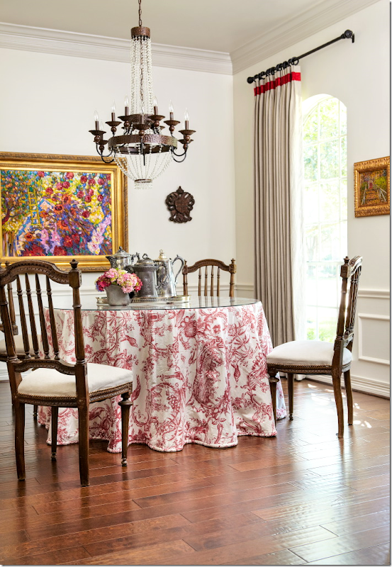
AFTER: It’s amazing what a coat of white paint can do for a room! The homeowner uses this room as a library. At the time this was taken, the chandelier hadn’t been hung.
RENOVATION STYLE: I’m not sure if Bonnie or the homeowner moved the books, but for this photo for the magazine, the ‘library’ is all dining room! A beautiful chandelier now hangs over the table and here, you can see her linen curtains with a red trim. As you might imagine, the homeowner told the magazine that red is her favorite color.
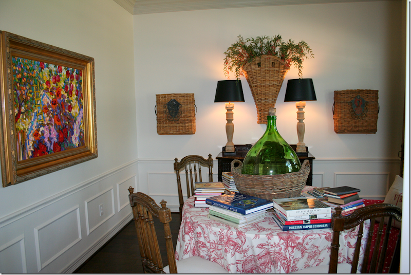
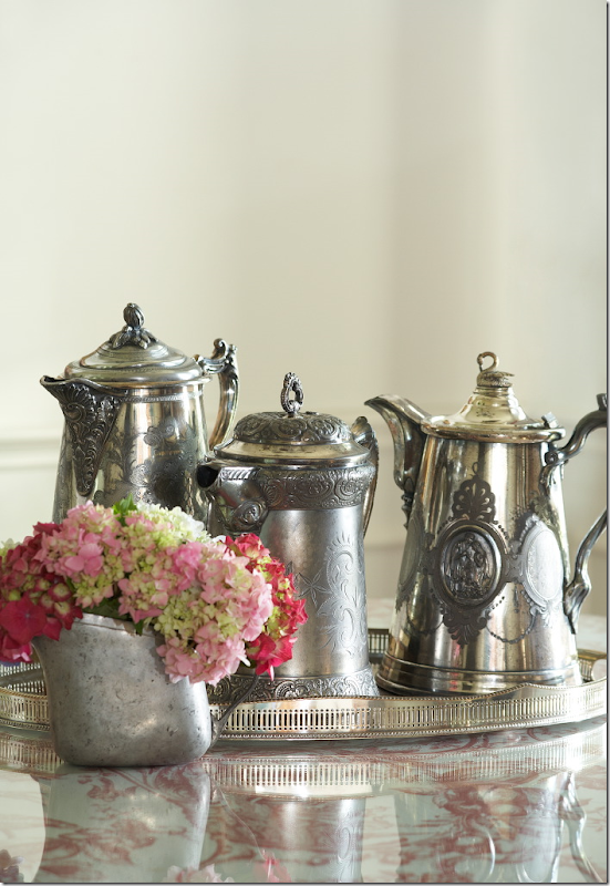
RENOVATION STYLE: Magazines always take “detail” shots – here the centerpiece in the dining room ended up as the first photograph shown in the story.
RENOVATION STYLE: This cabinet in the dining room once had no legs – the homeowner had her carpenter add them!! Inside is a collection of antique and hotel silver. So pretty!!
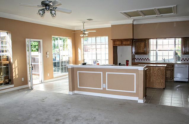
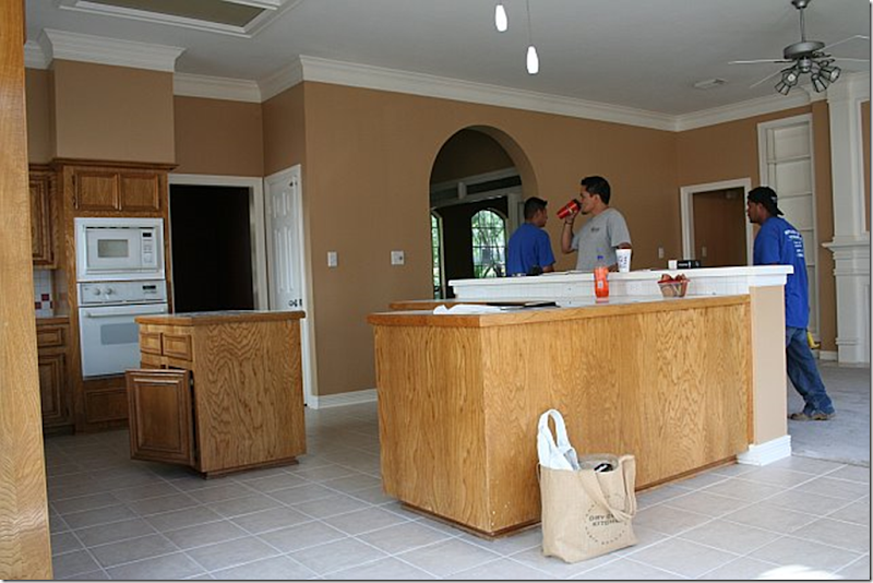
BEFORE: By far, the biggest change was in the family room – kitchen. The carpet and tile was replaced with hardwoods. The kitchen island and bar were replaced with one big island and new stainless appliances were bought one weekend at Lowe’s during a sale. The ceiling fans were also removed, as was the fluorescent light box.
AFTER: The new island is simply smashing. No other word for it. New Giallo Ornamental granite takes the place of Corian. The two lanterns, bought at market in Dallas add so much to the new atmosphere. They are just gorgeous. Notice that new crown molding was added on top of the cabinets to give them a more substantial look. The cabinets are original to the house.
BEFORE: Looking towards the family room over the old counter – the shelves flanking the fireplace were removed to make the area cleaner looking. Access to the bedrooms are through the doors.
AFTER: Looking towards the family room. New bin pulls from Lowe’s were added to the cabinets.
BEFORE: Here you can see the old door leading to the dining room – and the old pantry door on its right. The island and bar were not yet removed.
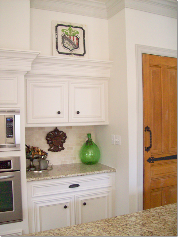
AFTER: The door from the dining room to the kitchen was closed off, adding more counterspace. The pantry door was changed out for an old door with hardware purchased at Atkins Architectural Antiques in Houston. Seagrass runner in the kitchen was added, as were textured bamboo shades at the kitchen garden window. Notice the crown molding allows for the homeowner to display trays and antique bread boards over the cabinets. The removal of the dining room door and the addition of the island were two huge improvements to the kitchen layout. The homeowner spent a large portion of her budget on the island – but she says it was worth it, and I agree. It’s fabulous.
When this house was first shown, a number of the comments concerned the gas stove – people wondered how was it added in so short a time. The homeowner answered with this: “There was already gas in the house so they were able to drop a line down from the attic into a cabinet. Then they dug a trench for the gas line in the concrete slab from the cabinet to the island, ran the line and then patched the trench. The island was built over the gas connection.” Simple!!!
Looking towards the front door and entry hall, with the office past the French doors.
Close up of the added cabinet where the dining room door was.
RENOVATION STYLE: The magazine’s only picture of the kitchen. Notice how they got the glimpse of the toile curtains into this view. Bonnie rearranged the trays and bread boards and pared down all her kitchen accessories. Styling this one shot probably took over two hours!!! Each photograph takes so long to get ready for. I was disappointed that there wasn’t a picture of the family room and kitchen together to give the readers the idea of the entire space, but the editors didn’t call for that view. When a house is photographed, the magazine editors have outlined before exactly what shots are to be taken from which spot. They judge this by using the preliminary photographs sent into the magazine by the scout. Any variation on this would have to be approved at the time by the editors. There are no surprises during photoshoots. The photographer can’t say – gee this would be a great shot. His photos are all predetermined.
RENOVATION STYLE: This detail shot of the bar with the homeowner’s collection of corkscrews didn’t make the final cut into the magazine story, although I’m sure Bonnie spent a lone time organizing the corkscrews just right.
RENOVATION STYLE: This view of the vintage pantry door didn’t make the magazine either. I love this closeup view of the hardware on the door – and of the corbel holding up the granite countertop.
AFTER: The breakfast room has a wooden chandelier in place of the ceiling fan. The toile curtains came from the homeowner’s former house and fit the windows perfectly.
RENOVATION STYLE: This picture was styled with an antique tablecloth the homeowner bought in a Paris flea market! I love this view of the scrolled iron legs on the table underneath the cloth. Again, Bonnie styled it perfectly with sunny sunflowers and rattan covered glasses. Confession – that’s my white ironstone pot that the flowers are in!!! Bonnie borrowed it for this shot. Notice how the camera is at knee level, rather than eye level. That’s what a tripod is great for. I’m just learning to use mine more. And again, the sun is miraculously streaming through the window. The photograph probably timed the photos to catch the sun in each room. This beautiful photograph was a full page in the magazine – but most of the floor was cropped out.
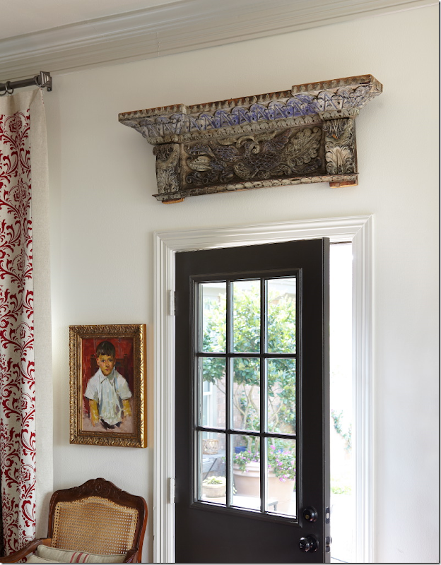
RENOVATION STYLE: This shot made the magazine – a detail showing the back door with the antique architectural fragment over it. When this was shown in the magazine, the picture was cropped – showing only part of the door and the fragment. I love the entire picture much better with the touch of toile and the chair showing.
AFTER: The family room. Many people commented on the large lamps. The homeowner loves to make lamps out of balustrades. But maybe she listened to the comments, because these two lamps were moved.
Another view showing the fireplace without the built in shelves and with the new brick surround. The fireplace is painted a darker shade of gray – to highlight it. (Paint colors listed at the end of the story.) I love that plate cabinet – it perfectly fits that small space! At this time, the TV was above the fireplace.
AFTER: Looking from the kitchen towards the family room. Here you can see the sconces flanking the fireplace. A new ceiling fan was added over this area – it is Houston after all!!!
RENOVATION STYLE: I was so surprised to see the new furniture arrangement, but I have to say it is much better – more open – without the sofa blocking the room off. The TV is now gone which may have influenced the rearranging of the room. There is now a painting over the fireplace and a darling oval footstool. A shutter was added behind the table on the left. Love the new family room arrangement.
RENOVATION STYLE: From this view, you can see the tall lamps were moved to the antique chest behind the sofa. They do look better there, I think. So pretty!
RENOVATION STYLE: This photograph was an entire page in the magazine! It is a beautiful vignette shot.
RENOVATION STYLE: This detail photo of the vintage selzer bottles did not make the magazine.
BEFORE: The bedroom was painted the same red as the dining room, while the bathroom was painted blue.
AFTER: Fresh paint and new carpet are the only changes in this large bedroom/sitting room.
RENOVATION STYLE: The bedroom taken at a much prettier angle. Love the slipcovered headboard and the large monogrammed pillows. But those lamps are my favorite. Gorgeous – silver candlesticks – they are just so wonderful!!!
AFTER: This view of the bedroom out the window that overlooks the back terrace. Pretty layered window coverings – linen curtains and bamboo shades.
RENOVATION STYLE: This picture of the same vignette taken closer up looks so much better. It really takes a professional to take pictures of houses. The homeowner took all the Before and After shots herself. Again, beautiful styling by Bonnie. I wonder if she even changed the paintings out to the side of the chair? This picture was a full page in the magazine, but it was cropped showing just the left chair and the left side of the table.
AFTER: The sitting room – I wish I could see the armoire!
RENOVATION STYLE: Here, a chest is now the coffee table and one lamp was removed for this picture. Alas, this photograph wasn’t used in the magazine story. Notice the Santa is missing from the side table – which is gone too! And notice Renovation Style magazine is seen in the basket. Hmmmm.
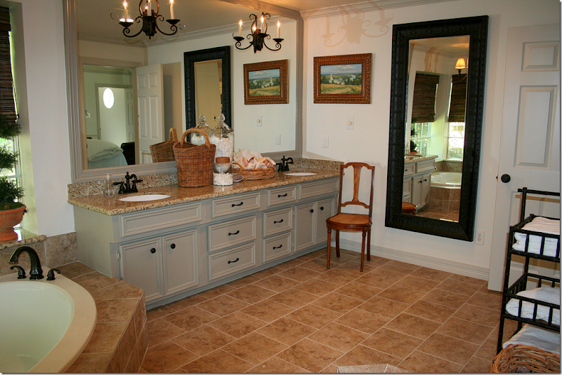
BEFORE: The carpeted master bathroom – needed remodeling.
AFTER: The bathroom – was retiled, the cabinets were painted and reworked, new fixtures and knobs were added, and the shower door was removed. Sconces were added to the mirror which was also framed in wood.
RENOVATION STYLE: This picture looks so much prettier than the After one. I don’t know if it’s the lighting or the addition of the rug – but it really looks great. Not sure if Bonnie brought the rug, or the homeowner added it herself. Love the blue and white vase. Such pretty styling. Half of this picture made it into the magazine – which is a shame, because the entire picture is so pretty I think. Notice how Bill captured the hanging shelf with towels and plants in the mirror’s reflection.
AFTER: A view of the newly tiled tub – and the shower with the door removed – that made such a huge difference. Love the shades and the chandelier.
RENOVATION STYLE: Water running from the overhead faucet – this didn’t make it into the magazine.
RENOVATION STYLE: This detailed shot didn’t make it either. I can only imagine how long Bonnie worked on this to make it perfect! Each shot is styled several different ways before a perfect photo is decided upon. Such a waste it wasn’t used.
BEFORE: The house was a foreclosure – and it had been run down and vandalized – before it was sold to the homeowner. The back yard was a real mess.
RENOVATION STYLE: The new terrace, after. Hard to believe it’s the same space. The family room and master bedroom both look out onto this area. Darling dog – I wonder how hard that was to catch him like that? This photograph did make the magazine at least!!
I hope you enjoyed looking back at this Incredible Renovation story one more time. I thought it would be interesting to see how the house looks today – and how it was styled for a magazine. I was really surprised how many photographs didn’t make it in the magazine – and how those that were are cropped. I was disappointed that the view of the kitchen and the family room wasn’t shown – how they relate to one another. I think that is such a beautiful shot!!! Below are some of the paint colors. For many more sources of furniture and fabrics, etc. see the magazine. Also, if you are interested, the magazine shows a floor plan.
A huge thank you to the homeowner and to Bonnie Broten and Bill Bolin for allowing me to use these gorgeous photographs.
From the homeowner:
· Paint Colors – (all Sherwin Williams satin finish)
· Kitchen Cabinets and Walls -- Shoji White (SW 7040)
· Trim – Worldly Gray – (SW 7043)
· Fireplace – Intellectual Gray (SW 7045)
· Front and Back door – Urbane Bronze (SW 7048)
· Exterior Trim – Anonymous (SW7046)
· Fabric: I bought the drapery fabric at High Fashion – I have no idea the name or manufacturer (sorry). It was at least 5 years ago.
· Lanterns: They are 25 high x 14.5 wide plus the half circle hanger (7 inches) that attaches to the chain. The 25 includes the finial like thing above the actual lantern.


